The secret to showing time in tag clouds…

Animatedtags

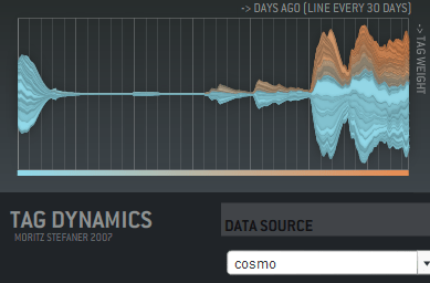
… is animation! I haven’t seen this used in any commercial sites, but Moritz Stefaner has a flash example of an animated cloud from his thesis. You should check out his other work there too, it includes some really innovative ways of displaying tags over time, like this graph showing tag usage:

Taggraph

His thesis title is "Visual tools for the socio-semantic web", and he really delivers 9 completely new ways of displaying the data, most of them time-based. Even better, he has interactive and animated examples online for almost all of them. Somebody needs to hire him to develop them further.

Moritz has his own discussion on the motivations and problems with animated tag clouds. For my purposes, I want to give people a way to spot changes in the importance of email topics over time. Static tag clouds are great for showing the relative importance of a large number of keywords at a glance, and animation is a way of bringing to life the rise and decline of topics in an easy to absorb way. Intuitively, a tag cloud of words in the subjects of emails would show ‘tax’ suddenly blinking larger in the US in April. On a more subtle level, you could track product names in customer support emails, and get an idea of which were taking the most resources over time. Trying to pull that same information from the data arranged as a line graph is a lot harder.

There’s some practical problems with animating tag clouds. Static clouds are traditionally arranged with words abutting each other. This means when one changes size, it affects the position of all the words after it. This gives a very distracting effect. One way to avoid this is to accept some level of overlap between the words as they change size, which makes the result visually a lot more cluttered and hard to read. You can increase the average separation between terms, which cuts down the overlap, but does result in a lot sparser cloud.

I’m interested in trying out some other arrangement approaches. For example, I’m fond of the OS X dock animation model, where large icons do squeeze out their neighbors, but in a very unobtrusive way. I’m also hopeful there’s some non-flash ways to do this just with JavaScript.

How to write a graph visualizer and create beautiful layouts

Mattnetwork

If your application needs a large graph, as I did with my Outlook mail viewer, the first thing you should do is check for an existing library that will work for you. Matt Hurst has a great checklist for how to evaluate packages against your needs. If you can find one off-the-shelf, it’ll save a lot of time.

If you need to write your own, the best way to start is absorbing this wikipedia article on force-based layout algorithms. It has pseudo-code describing the basic process you’ll need to run to arrange your graph. It boils down to doing a physics-based simulation of a bunch of particles connected by springs, that repel each other when they get close. If you’ve ever written a simple particle system, you should be able to handle the needed code.

It’s pretty easy to get something that works well for small numbers of nodes, since the calculations needed aren’t very intensive. For larger graphs, the tricky part is handling the repulsion, since in theory every node can be repelled by every other node in the graph. This means the naive algorithm loops over every particle every time when calculating the repulsion for each in the graph, which gives O(N-squared) performance. The key to optimizing this is taking advantage of the fact that most nodes are only close enough to be repelled by a few other nodes, and creating a spatial data structure before each pass so you can quickly tell which nodes to look at in any particular region.

I ended up using a 2D array of buckets, each about the size of a particle’s repulsion fall-off distance. That meant I could just check the immediately neighboring buckets that a particle was in to find others that would affect it. The biggest problem was keeping the repulsion distance small enough that the number of particles to check was low.

In general, tuning the physics-based parameters to get a particular look is extremely hard. The basic parameters you can alter are the stiffness of the springs, the repulsion force, and the system’s friction. Unfortunately, it’s hard to know what visual effect changing one of them will have, they’re only indirectly linked to desirable properties like an even scattering of nodes. I would recommend implementing an interface that allows you to tweak them as the simulation is running, to try and find a good set for your particular data. I attempted to find some that worked well for my public release, but I do wish there was a different algorithm that was based on satisfying some visually-pleasing constraints as well as the physics-based ones. I did end up implementing a variant on the spring equation that repelled when the connection was too short, which seemed to help reduce the required repulsion distance, and is a lot cheaper to calculate.

A fundamental issue I hit is that all of my nodes are heavily interconnected, which makes positioning nodes so that they are equally separated an insoluble problem. They often end up in very tight clumps in the center, since many of them want to be close to many others.

Another problem I hit was numerical explosions in velocities, because the time-step I was integrating over was too large. This is an old problem in physics simulations, with some very robust solutions, but I was able to get decent behavior with a combination of shorter fixed time steps, and a ‘light-speed’ maximum velocity. I also considered dynamically reducing the time-step when large velocities were present, but I didn’t want to slow the simulation.

I wrote my library in C++, but I’ve seen good ones running in Java, and I’d imagine any non-interpreted language could handle the computations. All of the display was done through OpenGL, and I actually used GLUT for the interface, since my needs were fairly basic. For profiling, Intel’s VTune was very helpful in identifying where my cycles were going. I’d also recommend planning on implementing threading in your simulation code from the start, since you’ll almost certainly want to allow user interaction at a higher frequency than the simulation can run with large sets of data.

See connections in your email with Outlook Graph

Outlookgraphscreenshot

Outlook Graph is a windows application I’ve been working on to explore the connections that exist in large mail stores. If you’re feeling brave, I’ve just released an alpha version:
Download OutlookGraphInstall_v002.msi.

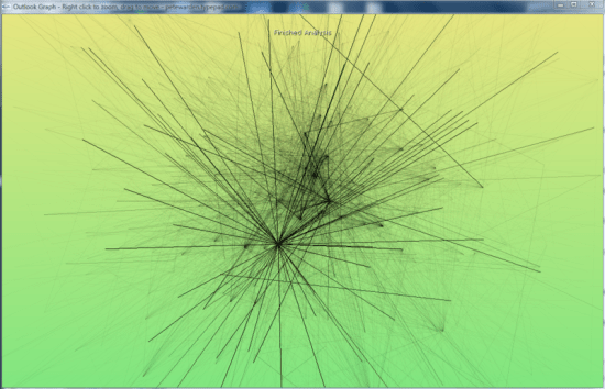
It will examine all of the Outlook mail messages on the computer, and try to arrange them into a graph with related people close together. The frequency of contacts between two people shown by the darkness of the lines connecting them. My goal is to discover interesting patterns and groupings, as a laboratory for developing new tools based on email data.

The application sends no network traffic, and doesn’t modify any data, but since it’s still in the early stages of testing, I’d recommend using it only on fully backed-up machines. It runs a physics simulation to find a good graph, so on very large numbers of messages it may take a long time to process. I’ve been testing on 10-12,000 message mailboxes on my laptop, so I’ll be interested in hearing how it scales up beyond that.

How to visualize hot topics from conversations

Twittercloud
I’ve found a new example of a good time-based visualization. Twitterverse shows a tag cloud of the last few hours, based on the world’s Twitter conversations. This is one of the things I’ll do with email, and it’s interesting to see how it works here.

There’s a lot of noise in the two-word phrases, with "just realized", "this morning", "this evening" and "this weekend" all showing up as the most common phrases. These don’t give much idea of what’s on people’s minds, but I can imagine you’d need a large stop word system to remove them, and that runs the risk of filtering out interesting phrases too.

A surprising amount of identifiable information came through, especially with single words. For example, xpunkx showed up in the chart, which looked like a user name. Googling it lead me to this twitter account, and then to Andy Lehman’s blog. It may just be a glitch of their implementation, but this would be a deal-breaker for most companies if it had been a secret codename gleaned from email messages. Of course, any visualization of common terms from recent internal emails would make a lot of executives nervous if it was widely accessible. Nobody wants to see "layoff" suddenly appear there and cause panic.

It’s also surprisingly changeable. Refreshing the one hour view every few minutes causes almost completely different sets of words to appear. Either the phrase frequency is very flat, eg the top phrases are only slightly more popular than the ones just below them, and so they’re easily displaced, or their implementation isn’t calculating the tag cloud quite in the way I’d expect.

The team at ideacode have done a really good job with Twitterverse, and there’s an interesting early sketch of their idea here. Max Kiesler, one of the authors, also has a great overview of time-based visualization on the web with some fascinating examples.

What most email analysis is missing…

Alarmclock
… is time. A mail store is one of the few sources of implicit data that has intrinsic time information baked in. The web has a very spotty and unreliable notion of time. In theory you should be able to tell when a page was last modified, but in practice this varies based on sites, and there’s no standard way (other than wayback) to look at the state of sites over an arbitrary period.

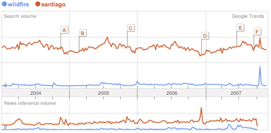
Once you’ve extracted keywords, it’s possible to do something basic like Google Trends. Here’s an example showing frequency of searches for Santiago and Wildfire:
Trendscreenshot
A friend suggested something similar for corporate email; it would be good to get a feel for the mood of the company based on either common keywords, or some measure of positive and negative words in messages. This could be tracked over time, and whilst it would be a pretty crude measure, could be a good indicator of what people are actually up to. Similarly, pulling out the most common terms in search queries going through the company gateway would give an insight into what people are thinking and working on. There’s privacy concerns obviously, but the aggregation of data from a lot of people makes it a lot more anonymous and less invasive. Its harder to turn the beefburger back into a cow, the combined data is a lot less likely to contain identifying or embarassing information.

Similar to Google’s trends, but with more information and better presentation is Trendpedia. Here’s a comparison of Facebook, MySpace and Friendster over time:
Trendpediascreenshot

So far, the examples have all been of fairly standard line graphs. There’s some intriguing possibilities once you start presenting discrete information on a timeline, and allowing interaction and exploration, especially with email. Here’s an example of a presidential debate transcript with that sort of interface, from Jeff Clark:
Transcriptscreenshot

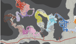
All of these show a vertical, one-dimensional slice of information as it changes over time. It’s also possible to indicate time for two-dimensional data. The simplest way is to accumulate values onto a plane over time, so you can see how much of the time a certain part was active. Here’s an example from Wired, showing how player location over time was plotted for Halo maps to help tweak the design:

Haloscreenshot

What’s even more compelling is showing an animation of 2D data as it changes over time. The downside is that it’s a lot harder to implement, and I don’t know of too many examples. TwitterVision is one, but it’s not too useful. Mostly these sort of animations have to be client-side applications. For email, showing the exchange of messages over time on a graph is something that could give some interesting insights.

Thanks to Matthew Hurst for pointing me to a lot of these examples through his excellent blog.

Can a computer generate a good (enough) summary?

Robot

A description of a document is really useful if you’re dealing with large amounts of information. If I’m searching through emails, or even when they’re coming in, I can usually decide whether a particular message is worth reading based on a short description. Unfortunately, creating a full human-quality description is an AI-complete problem, since it requires an understanding of an email’s meaning.

Automatic tag generation is a promising and practical way of creating a short-hand overview of a text, with a few unusual words pulled out. It’s somewhat natural, because people do seem to classify objects mentally using a handful of subject headings, even if they wouldn’t express a description that way in conversation.

If you asked someone what a particular email was about, she’d probably reply with a few complete sentences; "John was asking about the positronic generator specs. He was concerned they wouldn’t be ready in time, and asked you to give him an estimate." This sort of summary also requires a full AI, but it is possible to at least mimic the general form of this type of description, even if the content won’t be as high-quality.

The most common place you encounter this is on Google’s search results page:
Googlescreenshot
The summary is generated by finding one or two sentences in the page that contain the terms you’re looking for. If there’s multiple occurences, usually the sentences earliest in the text are favored, along with ones that contain the most terms closest together. It’s not a very natural-looking summary, but it does do a good job at picking out the relevant quotations to what you’re looking for, and giving a good idea whether it’s actually talking about what you want to know.

Amazon’s statistically improbable phrases for books are an interesting approach, they try to identify combinations of words that are distinctive to a particular book. These are almost more like tags, and are found by a similar method to statistics-based automatic tagging, by spotting combinations that are frequent in a particular book, and not as common in a background of related items. They don’t act as a very good description in practice, they’re more useful as a tool for discovering distinctive content. I also discovered they’ve introduced capitalized phrases, which serve a similar purpose. That’s an intriguing hack on the English language to discover proper nouns, I may need to copy that approach.

The final, and most natural, type of summary is created by picking out key sentences from the text, and possibly shortening them. Microsoft Word’s implementation is the most widely used, and it isn’t very good. There’s also an online summarizer you can experiment with that suffers a lot of the same problems.

There are two big barriers to getting good summaries with this method. First, it’s hard to identify which bits of the document are actually important. Most methods use location, if it’s a heading or the start of a paragraph, and statistical frequency of unusual words, but these aren’t very good predictors. Even once you’ve picked the ones you want to use, here’s also very little guarantee that the sentences will make any sense when strung together outside the context of the full document. You often end up with a very confusing narrative. Even MS in their description of their auto summary tool acknowledge that at best it produces a starting point that you’ll need to edit.

Overall, for my purposes displaying something like Google or Amazon’s summaries for an email might be useful, though I’ll have to see if it’s any better than just showing the first sentence or two of a message. It doesn’t look like the other approaches to producing a more natural summary are good enough to be worth using.

Email data mining by Spoke and Contact Networks

Mining

I’ve been thinking hard about painful problems that email analysis could solve, and one of them is the use of a corporation’s email store to discover internal colleagues who have existing relationships with an external company or person you want to talk to. For example, if you want to sell to IBM, maybe there’s someone in your team who’s already talking to someone there. Or internally, you might want an introduction to someone in another department to discuss a problem, and it would be good to know who in your team had contacts there already.

I was discussing these thoughts with George Eberstadt, co-founder of nTag, and he pointed me to a couple of successful companies who are already mining email to do this, Spoke and Contact Networks.

Spoke are interesting because they’re entirely client-based, rather than running on an organization’s whole message store. They work by taking data from everybody who’s running their Outlook add-on, along with information pulled from publicly available sources, and feeding into their own database. You can then search that yourself to find information on people you’re interested in contacting, and people you know who’ve already been in touch with them. It’s effectively creating a global social network largely based on the email patterns of everybody who belongs.

Technically, it sounds like they’re doing some interesting things, such as exchanging special emails to confirm that two people really do know each other, but when I tried for my own name, I didn’t get any useful information. I also am surprised that companies would allow the export of their employees email relationships to a third-party. It may just be that this is happening under the radar, but it seems like the sort of thing that a lot of companies would want some safeguards on. The service encourages individual employees to install the software themselves, without any warning that they might be opening up the organization’s data to third-party analysis. I know at a lot of the companies I deal with would frown on this, to say the least.

Contact Networks seem much more focused on selling to corporations as a whole, rather than individual employees. They build a social graph pulling from several sources internal to the company including email and calendars, CRM, marketing databases, HR and billing systems. They use this to identify colleagues who know a particular individual, which is a succinct description of a ‘painful problem’ that companies would be willing to pay money to solve. They seem to have been very successful, with lots of big-name clients and they were just bought out by Thomson.

It’s good to see how well Contact Networks have done, it’s proof there’s demand for the sort of services I’m thinking of, even if they have already solved the immediate problems I was considering.

Ethnography and software development

Mask

Ethnography, which literally means people-writing, is one way anthropologists study communities. They write very detailed and uninterpreted descriptions of what the people living in them do and say. These raw and unstructured accounts can be almost like diaries.

Most computer services are doomed to fail because they’re based on wishful thinking about the way their users should behave, not how they actually work. This is where ethnography comes in. Just like good user statistics, it forces you to stare the gloriously illogical humanity of people’s behavior square in the face. Only after you’ve got a feel for that can you create something that might fit into their lives.

Defrag was full of visionaries, academics and executives, people used to creating new realities, and changing the way people work. One of the most useful open spaces I attended was a session on how to bring web 2.0 tools into big companies. What amazed me was their visceral loathing of the imperfect tools already being used. My suggestion that there might be some valid reasons to email a document as an attachment rather than collaborating on a wiki was met with a lot of resistance. An example is the fine-grained control and push model for distribution that email offers. Senders know exactly who they’re passing it to, and though those recipients can send it on to others, there’s a clear chain of responsibility. With a wiki, it’s hard to know who has access, which is tricky in a political environment (ie any firm with more than two people).

Digging deeper, especially with Andrew McAfee, it felt like most of the participants had encountered these arguments as smokescreens deployed by stick-in-the-muds who disliked any change, which explained a lot of their hostility to them. It felt to me like the reason they are so effective as vetoes to change is that they contain some truth.

This smelt like a interesting opportunity, with a chance to take useful technology currently packaged in a form only early adopters could love (where’s the wiki save file menu and key command?) and turn it into something a lot more accessible to the masses, requiring few habit changes.

As a foundation for thinking about that, here’s some psuedo-ethnographic observations on how I’ve collaborated on written documents. They’re written from memory, and I’ve structured them into a rough time-line, and conglomerated all my experiences into a general description. This makes it not quite as raw as real ethnography, but it’s still useful for me to organize my thoughts.

  • Someone realizes we need a document. This can come down as a request from management, or it can be something that happens internally to the team. The first step is to anoint someone as leading the document creation. This often happens informally if it’s a technical document, and often ends up the person who’s identified the need. If it’s a politically charged document, the leader is usually senior, and often someone with primarily management duties.
  • Then, they figure out if it’s something that can be handled by one person, or if it really needs several people’s inputs. There’s a difference between documents that are shared for genuine collaboration, and those which are passed around for politeness’s sake, without the expectation of changes being made. Assuming it’s the first kind, there will be a small number of people in the core group who need to work on it, very seldom more than four.
  • If it’s documenting something existing, somebody will usually prepare a first draft, and then comments are requested from that small, limited group.
  • If controversial technical decisions or discretion are involved, then the leader will often do informal, water-cooler chats to get a feel for what people are thinking, followed by a white-board meeting with the core group. An outline of the document is agreed, with notes taken on somebody’s laptop, and often emailed around afterwards.
  • If someone’s trying to sell the group on an idea, they may create a background document first. This is usually sent as an email, with either content in the message, or a wiki link.
  • In most cases, the leader’s document is emailed around to the core group for comments. No reply within a day or two is taken as assent, unless the leader has particular concerns, and follows up missing responses in person.
  • For very formal or technical documents, changes will be made in the document itself. More often the comments will be made in an email
  • thread, and the leader will revise the document herself with agreed changes, or argue against them by email, or talking directly to the person.
  • Documents being collaborated on are rarely on the wiki. Word with change tracking enabled is the usual format. Standing policy and status documents are two big exceptions. They’re almost always on the wiki, but may not appear there until they’re agreed on.
  • Final distribution is usually done by email. For upwards distribution to management, this will be as a document or email message. For important ones, this is often only a short time before or even after a personal presentation to the manager who’s the audience, to manage the interpretation.
  • For ‘sideways’ delivery to colleagues, a wiki link may be used, though the message is still sent by email, and might be backed up with an in-person meeting.

This is just a brief example, but looking through these raw notes, a few interesting things leap out at me. Who sees the document at each stage is important to the participants. It’s possible to argue that this is a bad thing, but it’s part of the culture. We aren’t using our wiki for most of our document collaboration, it’s still going through email and Word, which might be partly connected to this.

It’s a useful process, it’s a way of looking at the world that helps me see past a lot of my own preconceived ideas of the way things work, through to something closer to reality. Give it a shot with your problems.

Defrag: Visualizing social media: principles and practice

Homer
Matthew Hurst, from Microsoft, gave the second Defrag talk on the topic of visualizing social media. He described JC Herz’s first talk as complementary to his, covering some of the same problems, but from a different angle. He started by laying out his basic thesis. Visualization is so useful because it’s a powerful way to present context to individual data points. It ties into the theme of the conference because while web 1.0 was a very linear experience, flicking through pages in some order, 2.0 is far more non-linear, and visualizations can help people understand the data they now have to deal with through placing it in a rich context.

He then ran through a series of examples, starting with the same blog map that he’d created, and JC had used as a negative example in her talk. He explained the context and significance of the images, as well as the fact they were stills from a dynamic system, but did agree that in general these network visualizations have too much data. He introduced a small ‘Homer’ icon that he added to any example that produced an ‘mmmm, shiny, pretty pictures’ reaction in most people, without necessarily communicating any useful information.

The next example was a graph of the blogosphere traffic on the Gonzales story, generated by BuzzMetrics. This was a good demonstration of how useful time can be in a visualization. After that came an impressive interlocked graph, which after giving the audience a few seconds to oh and ah over, he introduced as a piece of 70’s string art! A pure Homer-pleaser, with no information content.

The next picture was a visualization of the changes in Wikipedia’s evolution article over time. This was really useful image, because you could see structures and patterns emerge in the editing that would be tough to see any other way. There’d been an edit war over the definition of evolution, and the picture made it clear exactly how the battle had been waged.

TwitterVision got a lot of attention, but isn’t much use for anything. It gives you information in a fun and compelling way, but unfortunately it’s not information that will lead you to take any action. To sum up the point of showing these visualizations, he wanted to get across that there’s a lot of techniques beyond network graphs.

He moved on to answering the question "What is visualization?". His reply is that the goal of visualization is insight, not graphics. Visualizations should answer questions we didn’t know we had. He returned to the blogosphere map example, to defend it in more detail. He explained how once you knew the context, the placement and linkages between the technology and political parts of the blogosphere were revealed as very important and influential, and how the density of the political blogosphere revealed the passion and importance of blogs on politics.

(Incidentally, this discussion about whether a visualization makes sense at first glance reminds me of the parallel endless arguments about whether a user interface is intuitive. A designer quote I’ve had beaten into me is ‘All interfaces are learnt, even the nipple’. The same goes for visualization, there always has to be some labelling, explanation, familiarity with the metaphors used and understanding of the real-world situation it represents to make sense of a picture. Maps are a visualization we all take for granted as immediately obvious, but basing maps on absolute measurements rather than travel time or symbolic and relative importance isn’t something most cultures in history would immediately understand.)

He also talked about some to Tufte’s principles, such as "Above all else, show the data". He laid out his own definition of the term visualization; it’s the projection of data for some purpose and some audience. There was a quick demonstration of some of the ‘hardware’ that people possess for image processing that visualizations can take advantage of. A quick display of two slides, containing a scattering of identical squares, but one with a single small circle in place of a square, shows how quickly our brains can spot some differences using pre-attentive visual processing.

A good question to ask before embarking on a visualization is whether a plain text list will accomplish the same job, since that can be both a lot simpler to create, and easier to understand if you just need to order your data in a single dimension. As a demonstration, he showed a comparison of a table listing the ordering of 9/11 terrorists in their social network based on four different ranking measures, such as closeness, and then presented a graph that made things a lot cleared.

He has prepared a formal model for the visualization process, with the following stages:

  • Phenomenon. Something that’s happening in the real world, which for our purposes includes out on the internet.
  • Acquisition. The use of some sensor to capture data about that activity.
  • Model/Storage. Placing that data in some accessible structure.
  • Preparation. Selection and organization of the data into some form.
  • Rendering. Taking that data, and displaying it in a visual way.
  • Interaction. The adjustment and exploration of different render settings, and easy other changes that can be made to view the data differently.

There’s actually a cycle between the last three stages, where you refine and explore the possible visualizations by going back to the preparation to draw out more information from the data after you’ve done a round of understanding more about it by rendering. You’re iteratively asking questions of the data, and hoping to get interesting answers, and the iteration’s goal is finding the right questions to ask your data.

Web 2.0 makes visualizations a lot easier, since it’s a lot more dynamic than the static html that typified 1.0, but why is it so important? Swivel preview is a great example of what can be done once you’ve got data and visualizations out in front of a lot of eyes, as a social experience. The key separation that’s starting to happen is the distinction between algorithmic inference, where the underlying systems make decisions about importance and relationships of data to boil it down into a simple form, and visual inference, where more information is exposed to the user and they do more mental processing on it themselves. (This reminded me of one of the themes I think is crucial in search, the separation of the underlying index data and the presentation of it through the UI. I wish that we could see more innovative search UIs than the DOS-style text list of results in page-rank order, but I think Google is doing a good job of fetching the underlying data. What’s blocking innovation at the moment is that in order to try a new UI, you have to also try to catch up with Google’s massive head-start in indexing. That’s why I tried to reuse Google’s indexing with a different UI through Google Hot Keys.)

One question that came up was why search is so linear? Matt believes this can be laid squarely at the door of advertising, there’s a very strong incentive for search engines to keep people looking through the ads.
Defrag: Web 2.0 goes to work

Hardhat

Rod Smith, the IBM VP for emerging technology, had a lot to squeeze into a short time. I had trouble keeping my notes up with his pace, and I wish I had more time to look at his slides. They often seemed to have more in-depth information on the subjects he described, I will contact him and see if they’re available online anywhere. (Edit- Rod sent them on, thanks! Download defrag_keynote.pdf
 

They are well worth looking through.)

He started off by outlining his mission in this presentation. He wanted to talk about the nuts-and-bolts issues of the technology behind 2.0, and why so many businesses are interested in it. The first question was why 2.0 apps are produced so much quicker than traditional enterprise tools?

Part of the reason is that they tend to be a lot simpler, and more focused on solving a specialized problem for a small number of people, rather than tackling a general need for a wide audience. Being built on the network, they are naturally more collaborative, and support richer interactions between people. They also tend to be built around either open or de facto standards. Because they are comparatively light-weight, they can be altered to respond to change a lot more easily too.

DIY or shadow IT, technology developed outside of the IT department, has always been around. Business unit people have been writing applications as Excel macros for a long time. (On a personal note, Liz is an actuary with a large health insurer, and she’s been creating complex VBA and SAS applications for many years as part of her job.) What 2.0 brings to the table is a lot of interesting ways to link these isolated projects together, for example by outputting to an RSS feed, which can then be routed around the company. People in business units are now a lot more tech savvy than they used to be, which also really helps the adoption of these tools.

He moved on to talk about the practicalities of creating "five minute applications" or mashups. The biggest hurdle always seems to be how to get easy access to the data? "I have all this data from years of doing business, how do I unlock it?"

As an example, he looked at how StrikeIron had created a location-based mashup of Dun and Bradstreet’s business information service, for establishing the legitimacy of a company you’re dealing with, or finding likely sales prospects. (I saw a screenshot of an actual map display, rather than a text summary, but I can’t locate that.)

Old companies have accumulated a lot of potentially very useful and valuable data, but there’s not much use being made of most of it. The question, as above, is how to make that data mashable. The term often used for this part of the process is ‘widget composition’, which covers a lot of different technologies, from Google gadgets to TypePad widgets.

There are of course some dangers with the brave new world of Web 2.0 in business. One of the strengths of traditional IT is that there’s accountability and responsibility for ensuring service availability and data accuracy. If a service created by a business unit member becomes widely popular, should they be the ones to maintain and update it, or is there a process to transfer that to IT? There’s little visibility from the CIO and IT manager level as to what’s going on with these shadow IT projects. It’s like the early days of internal web servers being installed across companies in an ad hoc way, we’re only just sorting out the tangle that resulted from that. There’s also some unique issues with digital rights management and copyright once you’re sending data through feeds. It’s not so much like music DRM where the problem is malicious actors trying to steal, as just allowing people to keep track of what the right attribution and correct uses of the data are.

Copyright.com has done some interesting work in this area, creating meta-tags to attach to data that allows automatic handling based on rules for different attributions.