Five short links

Fivebirds

Photo by Nick Kenrick

Massive Scale Data Mining for Education – Companies invented Big Data techniques for mining useful information from a mountain of behavior information to optimize shopping sites, and now they're well-understood I'm excited to see how they can be applied to other areas. This post outlines one idea for applying them to education – I've no idea how well this would work in practice but I'd love to see the results.

Giant Tesla Coils – A project to create 200 foot-long bolts of artificial lightning. I don't have to explain how awesome this is.

Zynga's tough culture risks a talent drain – There's something about 'fun' industries like games or films that seem to encourage terrible working conditions. Much as I love data, it's really hard to use it to drive personnel decisions, see Enron for a classic example.

Forward Secrecy – Google's doing great work by supporting this improvement to https, including code contributions to OpenSSL.

Common Crawl Email List – CC is a fantastic project to create a sharable data set of web content, and I'm glad to see a community starting to grow up around it. Now, who will post the first message?

How to post a screenshot of your site to a user’s Facebook account

Jetpacshot0

If a user shares your site's content as a photo on Facebook it's incredibly powerful marketing. It means you've produced something compelling enough that users want to show it off to their friends, and it gives you a good chance to entice those friends to try your service. It's pretty hard to figure out how to implement it though, there's a lot of moving parts and no examples that show how to put them all together. Since I just added this as a new feature on Jetpac and it's been a big hit, I thought I'd share how I did it.

Asking for extra permissions

One of the nicest surprises about jumping back into Facebook development after a long hiatus was how savvy users are about permissions. In the old days people tended to click through no matter what was there, but I found our acceptance rate dropped off a cliff when we had 'publish_stream' as default. I'm guessing that's because users have been burned by spammy apps, so I now ask for a lot fewer permissions on the first connect. That meant that the first step after a user clicked on the 'Share' button was to ask for that extra permission.

Actually though, there's a step before that, as suggested by my friend Jeff Widman. He's had a lot of experience optimizing Facebook conversions and he recommended a short dialog explaining why I was going to ask for permissions before sending the users to Facebook's site. That seemed obvious after he said it, so I whipped up a quick explanation:

Sharedialog

The next challenge was how to send the user to a new login dialog that requested the publish_stream permission. We're using the OmniAuth gem in Ruby, and with a bit of Googling I found Mike Pack's explanation of how to add an extra setup stage in Ruby on Rails. It was a bit funky, involving returning a 404 code to indicate success for example, but it worked like a charm. Here's the Sinatra version I ended up with:

Rendering the screenshot

It's surprising just how hard it is to take a screenshot of a web page. For very good security reasons it's not something you can do in a general way on the client side. It's still possible to run a signed Java Applet if you can persuade your users to click through scary security dialogs, but there's no other way I know to access the browser's rendering of the DOM. You can write your own HTML renderer into something like Canvas, or use Flash's renderer, but those have very patchy results.

That meant I had to investigate server-side rendering. In the past I'd experimented with using Firefox as a headless browser, but I was intrigued by what I'd seen of tools like PhantomJS that use QT's built-in support to render using webkit. This turned out to be a good solution, with a few things to watch out for:

– It's not truly headless. You still need X Windows to run it, but happily xvfb-run is easy to install and does the trick, at the cost of a bit of startup overhead and complexity.

– It takes about 15 seconds to render in our case, which is long enough that we needed some kind of frontend logic to tell the user that we're still working on it.

– If things go wrong, there's no obvious error messages, the output image just isn't there. I didn't debug deeply enough to figure out if there's some stderr that I'm missing, or if it's lost in the bowels of X Windows somewhere, but when there's a problem it makes figuring it out tough.

– The best way I could find to integrate it was through a system call to an external process. In my case the URL has no user input, but if it did you'd need to validate everything that goes into the command string to avoid nasty security issues. It also meant lots of kludgy bouncing of data back-and-forth between the script and the file system.

– You'll have to think about how to authenticate the call, since the server-side page request won't automatically inherit the user's normal cookies. In my case I ended up packaging the authentication information so I could appear to be the user as far as my frontend server was concerned.

– You'll see scroll-bars baked into the result unless the image is the same size as the rendered page. In my case we have CSS that always causes this problem no matter what size you specify! I'll be putting in a fix to special-case the styling as a workaround tomorrow, but there doesn't seem to be a general way to solve this.

Here's the function I wrote to convert a URL into an image:

Uploading the screenshot to Facebook

We're almost there! The final hurdle was figuring out how to use Facebook's API to actually upload the image to the user's profile. I was excited when I ran across an official blog post describing how to do this, but unfortunately it only shows how to craft a form a user can use to upload a file from their own machine. I needed something that would emulate a multipart form post from Ruby, and happily I discovered Cody Brimhall's module that did exactly that. I had to modify it a little since it still expected to pull the data from a file on the server, instead of an in-memory object, but that was easy enough. Here's the modified module:

And here's a snippet of code that shows how to call the Graph API with the right form data:

Before I call this, I give the user a preview of the image and the chance to write a custom caption for it:

Jetpacshot1

I was briefly tempted to give people an option to tag friends who are mentioned in the profile but that felt too spammy, and it turns out it's prohibited by Facebook anyway. In the future we might make it easy for users to 'Send' the photo, but it's a very delicate line to tread. We've seen decent uptake from it just appearing in the stream, so we're happy with that for now.

There you have it, the three steps towards screenshot sharing nirvana! If you've got something remarkable enough that users want to share it with their friends, now you can make it easy for them and drive your own growth at the same time.

Five short links

Fiftyfive

Photo by CJ Schmit

Github Secrets – One of the things I gave thanks for on Thursday were the improvements I've seen in my development environment recently. I was sceptical after being burned by previous 'upgrades', but Xcode 4 is a big step forward, and this post illustrates why Github has been a godsend. It's built by people who live the same problems as me, and it's great to see all the easter-egg features they've snuck in to solve them, even when they haven't been able to expose them through the UI.

Downloading the WIGLE data set – I've been working on an update for my data sources handbook, and I was excited to see a user-generated database of Wifi networks. Unfortunately it's a write-only store in a lot of ways. You can use their proprietary desktop tool to access the data in small chunks, but there's no way of downloading the complete set. I understand their reasoning in a narrow sense, they want to generate value from their data set by keeping it under wraps, but I think they're missing a big opportunity. There's already commercial providers of this information, they could reach a whole different set of people, follow the Wikipedia model instead of the Encyclopedia one.

Libraries – Where it all went wrong – An inspired rant by my friend Nat Torkington. I still love libraries, they were my haven and inspiration as a kid, but they're no longer part of my life.

Weathermob – Crowdsourced weather on your iPhone. I see Britain as a market ripe for the picking, considering the proportion of my conversations with friends and family that are about the weather. They should have used 'cloud-sourcing' somewhere in the message though.

Flamethrower Storage – A notice from an Antarctic researcher with too much time on their hands.

How to create a terrible visualization

Whereshot0

The last couple of visualizations I've done have been complete flops, at least in terms of traffic. A geeky post about my profiling habits got more visitors than a shiny 3D globe! It's never fun to confront it but as Bob Sutton says; 'failure sucks but instructs'. In that spirit, here's what I learned about how to create an unpopular visualization: 

Tell lots of stories at once

I love exploring complex data sets, but it takes a lot of effort and time. Most people are looking for a quick insight, something catchy, unexpected, but obvious once you see it. Unless you have a one-sentence message that you can get across in the first few seconds, the audience will move on. The two really popular visualizations I built (the Five Nations of Facebook and the iPhone tracking app) had a strong, simple story attached. The most recents ones have been exploratory tools without much of a narrative behind them.

Focus on the technology

I'm completely technology-driven. My starting point is always finding interesting but unused data, and trying to bring it to light as a visualization. That often involves creating new techniques to capture and show the information, but my weakness is that I'll often fall in love with those techniques, at the expense of the end result. With the globe, I rely completely on WebGL, so only people with Chrome or Firefox on a non-mobile device could view it. I get excited just by the idea of being able to run complex 3D rendering inside of a browser from Javascript, but I know that leaves me in a minority.

Advanced technology like that is essential for a strong visualization, but you need something more on top. Often having a static image of the result is the most powerful product, if you can impress people with that it means you have a story that doesn't require them to interact with a tool to understand. I'd actually had my Facebook visualization out for a couple of weeks as an interactive service with almost no visitors. It was only when I created a throwaway blog post with a screenshot and some funny names that it reached millions of people.

Copy a previous success

People pass a link to their friends if they think it's remarkable, something they've not seen before. That means that the bar keeps getting higher and it's very hard to repeat an approach that worked before and get the same results. A couple of years ago there weren't very many online visualizations, so it was a lot easier to get noticed. I've been excited to see so many amazing projects appear recently, as a visualization fan it's been a golden age, but it does mean the competition is a lot stiffer. You need to build something above and beyond what's already been done to get noticed.   

Leave out the magic

One of the things I love about creating visualizations is that it's more art than a science. There is no formula for success, and the only way I know to make progress is to follow my own curiosity. A visualization really taking off depends on dozens of things all going right, so the whole process does feel like magic sometimes. At heart I'm building them for my own enjoyment, and I hope that comes out in the results. People do seem to respond to a sense of fun, and the best way to create a boring visualization is to force one out.

In the past I've effectively been goofing off when I was working on a new graph, procrastinating on my real work, but these days my responsibility for Jetpac is always in the back of my mind. That has cramped my imagination, so I'll be trying to get back to my footloose and fancy-free roots and worry less about traffic. I can't guarantee a more whimsical approach will give more interesting visualizations, but I know for sure I'll be having more fun!

The View from Your Window Globe

Vfywshot

The View from Your Window Globe

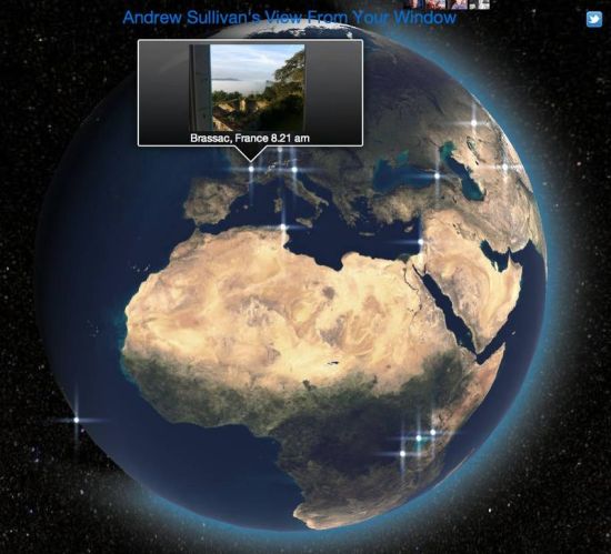
I love Andrew Sullivan's 'View from Your Window' feature. Readers from around the world send in their favorite shots, and over weeks and months you start to see a picture of the whole world emerging. Unlike the usual news-driven photography, these are all quiet, subtle shots without any commentary and few people. Individually they're not striking, but together they become something magical.

Andrew's already published a book of the best photos, but I've always wanted a more dynamic way to explore the hundreds of images. Last year I created an OpenHeatMap showing the locations, but VFYW always makes me imagine a day in the life of the planet, so I kept trying to imagine better ways to share that vision. The recent rise of WebGL meant I could finally build something truly interactive, a 3D globe showing the world taking photos as the day progresses:

http://vfyw.jetpac.com

It does use the latest HTML5 features so you'll need a recent version of Chrome or Firefox before you can use it. I have contacted Chris Bodenner at the Daily Dish to make sure they're happy with this new view of their content, but I'm not affiliated with them in any way, just a fan! A big thanks to the Google folks for their WebGL sample code too, MrDoob for his fantastic Three.js framework, and JHT for the earth textures.

Why you need a minimum-viable profiler

Casiowatch

Photo by Antonio Rodriguez

Chances are that you'll hit performance problems on any non-trivial project, so you'll need some kind of profiling. Scripting languages have poor profiling support, with intrusive tools that require fiddly setup and lack strong interfaces. This is understandable, raw performance is much less of a priority when you control the hardware the code runs on and can scale horizontally, but the lack of casual profiling can really slow down development.

As a result I've ended up rolling my own painfully simple profilers when I'm working in PHP, Python or Ruby. The beauty of this minimal approach is that you don't have to spend time setting up the big guns like xdebug or perftools, most issues are obvious from a surface inspection and there's no external dependencies to juggle. I wrap the top-level modules of my code with profiler calls, and then output the results to stderr once the script's done. There's usually only five or six timings, but it's enough to answer most questions about 'why is this taking forever?'. If not I can dive into the offending function and manually add more detailed timing output. The key is that it has to be lightweight and easy to deploy (meaning no external dependencies) or it loses a lot of its value.

As an example I've open-sourced the Ruby version I'm using on Jetpac's data pipeline:

https://github.com/petewarden/minimalprofiler

You bracket your whole script with MinimalProfiler.start/stop('MAIN') calls, and then wrap any significant high-level functions with MinimalProfiler.start/stop('Some function'). This is obviously a lot more manual and error-prone than a more automatic approach, but in practice it's not hard to maintain, and when a module becomes a hotspot you can add more calls within the function. At the end of the script it writes out a summary of where the time went:

Total time 3.001541 seconds

33% – Something else (1.001017 seconds)

66% – Doing something (2.000449 seconds)

I'm not suggesting my particular implementation is better than a full profiler, but it's way better than no profiler at all, which is the status quo for web development. It's only a single page of code, so if it's not to your taste rewriting it for your own needs shouldn't be a problem. Just make sure it's easy to deploy and use, and you'll be amazed at how much time you'll save tracking down performance issues.

Five short links

Chakras

Photo by Omnos

ASTER GDEM – It turns out there's more than one global set of elevation data! Thanks to Matthieu Molinier for pointing out this alternative to SRTM3 that has better coverage on steep terrain and high latitudes.

Frontend view generation with Hadoop – Anyone who's built big data pipelines has to confront the problem of how to efficiently output the results. If the output data is small, doing a normal load from CSV into a database, or even running dynamic insertion calls can be fast enough, but as soon as it's something larger (like a search index) writing out the results will be a bottleneck for the whole process. I first ran across a pattern to tackle this at Backtype; writing out binary BerkeleyDB database files directly to disk from the final reducer stage and then just hot-swapping them in so they're available to the front end. This post from Datasalt looks at some other ways of doing the same thing with different technologies, including Voldemort and SOLR. I'd never seen SOLR used as just a distributed key/value store, it feels a bit like using Concorde for crop-spraying, but they seem to have had luck with it for their application.

Vizify – A clean dashboard of statistics and visualizations of your Twitter activity (here's my profile). They have some fun with an Angry Birds clone, with a cunning hook asking you to tweet your high score.

Topsy Analytics – I knew these guys had been doing some fascinating backend real-time search work, but I didn't realize they exposed analytics too. We'll actually be moving into their building in a couple of weeks, to cope with the growing team, so I look forward to geeking out with them.

A simple explanation of Benford's Law – I don't find it quite as simple as they hope, but it is an approachable but rigorous look at one of the most fascinating statistical hacks around. I'm just worried that by popularizing it, fraudsters will wise up and we'll lose one of the easiest ways to spot dodgy numbers!

Ten terrible captions – Why your friends hate your kid photos

Graduation

Photo by Jesse Menn

On average your friends share 200,000 Facebook photos with you and my job at Jetpac is to turn them into beautiful slideshows. To do that I've had users manually rate over a million friends' pictures so I can train algorithms to automatically identify the good ones. What I found interesting is that the worst photos are obviously aimed at a narrow audience, like your family or colleagues:

#1 – Mommy – 3.26%

#2 – Graduation – 3.85%

#3 – Daddy – 4.33%

#4 – Reunion – 5.36%

#5 – CEO – 6.03%

#6 – Social – 6.08%

#7 – Grandpa – 7.61%

#8 – Cousins – 7.72%

#9 – Hyatt – 8.65%

#10 – Niece – 9.30%

The percentage is how many photos with those words in the caption were rated as 'good' by our testers

The real lesson here isn't that we shouldn't take pictures of our kids, it's that we need a better way to target our pictures to the people who care about them. Our co-workers are the audience for the CEO getting blitzed at the Hyatt bar but it's hard to share with only them. Facebook's working on lists and finer-grained access controls, and Google's built the whole of Plus around circles, but none of them are very easy to use. Until we have something better, our social streams will be full of pictures we don't want to see.

Is Michigan more beautiful than Italy?

Lakemichigan

Photo by Rachel Kramer

I can now officially pronounce Michigan as the fifth most beautiful place in the world!

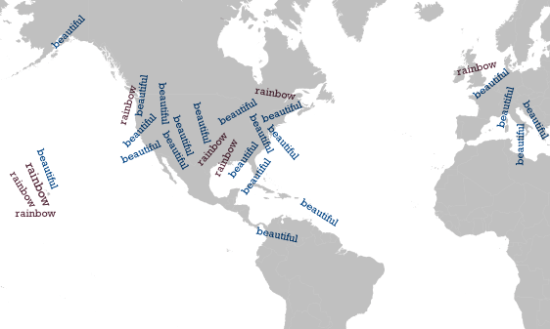
With the launch of Jetpac, my big data science job is identifying the photos you'll find most inspiring. I've been exploring the 50 million captions you've shared with us so far, trying to identify patterns, and it really is the most fun part of my day! There's so many surprises hidden in the data, but one of the biggest came when I calculated the places where people were most likely to use the word 'beautiful' in their captions:

#1 Sedona, 10.8x

#2 Cabo San Lucas, 9.7x

#3 Lake Victoria, 6.6x

#4 Amarillo, TX, 6.2x

#5 Michigan's Upper Peninsula, 6.0x

#6 Algarve, Portugal, 5.9x

#7 Montevideo, Uruguay, 5.9x

#8 Bath, UK, 5.9x

#9 Florence, Italy, 5.8x

#10 Hood River Valley, Oregon, 5.2x

A lot of those made perfect sense, who doesn't love Sedona or Lake Victoria, but I had to triple-check my calculations when Michigan showed up! How did the world center of trashed building photography end up in fifth place above Florence?!

As I looked through my friends photos on Facebook and the public ones on Flickr it all started to make a lot more sense. The area around Lake Michigan and the Upper Peninsula in particular are full of stunning scenes, with the storms, massive skys and cliffs producing amazing shots. 

Michigansky
Photo by Kevin Dooley

So now the results started to make a lot more sense. The numbers don't lie! Now I just need to see if I can get a free vacation from the Michigan Tourist Commision, I'm actually itching to check it out after being sucked in to all the photos I've had to check out. I've discovered somewhere new in the world that I'm dying to visit, even though I'd never have thought of going there in a million years.

If you're as interested in playing with the data as I am, I've also put up a tool where you can find the distribution of any words that show up a lot in our 50 million photos, including beautiful, I'd love to hear what patterns you find.

Beautifulrainbow

About that awesome video

No, not my one from yesterday, the product demo we have on the front page of Jetpac! I wasn't sure we should be spending time and effort on something that seemed non-critical, but it turned out to be incredibly useful in explaining what we're doing and persuading users to try us out. I spent years working on high-end video software, so I tend to be very critical of production work, but the producer Mike Kaney did an amazing job, even on very tricky elements like the reflections. What's even more impressive is that he achieved all this on a startup budget! If you're interested in getting something made for one of your own projects, check out his Rockbridge production company and tell him we sent you.

I have to mention the star performance by Jetpac's very own mad marketing genius Stephanie Southerland. Despite no background in acting, she's apparently a natural performer, even on top of a building in her swimwear on a freezing-cold November day.