A Mad Engineer at SciFoo

Madengineer
From Cowbirds in Love

I’m not quite sure how an engineer got invited to SciFoo, it was all very mysterious, but I’m planning on having fun! I am passionate about the possibilities for answering some of the important questions using the new sources of data we’re all creating on the web, so I’ll be evangelizing cheap web crawling, analysis using Hadoop and of course visualization. After some last minute idiocy on my part over the hotel, I’m now all set for the flight to San Jose tomorrow, and my first visit to the Google campus.

Talking of visualization, I was really curious to see where the other attendees would be coming from, I built a special-edition OpenHeatMap to display the locations of the attendees mentioned on Kaitlin Thaney’s Twitter list:

Scifoomap

Here’s the full interactive version. You can also now do the same for any Twitter list in the main app by typing in list:user/list-name in the main Twitter Followers search box.

Discrimination and sticking your hand up

Raiseyourhand
Photo by Cpt. Obvious

This article by Stubbornella on women in technology was a great summary of what I've seen in my programming career. I've seldom witnessed overt discrimination, there's no girlie calendars in the break-room, but we're terrible at assessing and promoting coders according to how effective and efficient they are. Instead there's a tendency to reward the qualities that Nicole lists under 'Cowboy-coders', even when these people have a negative impact on our ability to ship product.

Why does this matter? It's insanely hard to build great software, it's really tough to find strong engineers, and a system that discourages a large proportion of entrants with the potential to grow into those engineers is broken.

The point that Nicole mentions but doesn't go into depth on, is that this isn't just about women. Some of the most technically brilliant male coders I've worked with are still quietly working away with zero recognition from either their own companies or the outside world. I've always loved talking about my work, and that's driven me to overcome my innate shyness and learn to perform in public, and generally be pretty vocal with my opinions in discussions. This is vital in a profession infested with arrogant jerks, and sometimes I wonder if I've had to become one too. I try hard to "act like I'm right, but listen like I'm wrong", but that's a very fine line.

We tend to take this as a law of nature, that's how people get ahead in the programming world, but it's a sign of both poor management and a very ineffective culture. By contrast my partner Liz is a trained actuary, her job involves a decade of taking exams and some very deep math, and almost all of her old department was women. You don't have to be a pushy jerk to get noticed as an actuary, there's actually a system for actively finding and rewarding talent, and as if by magic, there's a lot more women in the profession.

Our problem is that we're fixated on a romantic image of programming, one full of individual rock-stars producing astonishing products thanks to all-night coding sessions. The problem is this doesn't work, at least not consistently or reliably. The reality of building great software is that it's a long process that takes a lot of teamwork. Our immature reverence for aggressive self-promoters leads to poor outcomes, and even if you don't give a fig about discrimination, that's still a massive problem.

So how do we fix it? I'm actually still a bit ambivalent about Google's scholarship specifically for women, though I can see why it makes sense in a lot of ways. I'd much rather see companies and individuals in leadership positions actively seeking out strong engineers to speak and attend conferences, rather than waiting for people to come to their attention, since that rewards loud-mouth folks like me. We need to find more people who are quietly doing great work, without waiting for them to stick up their hand.

Visualizing the war deaths in Afghanistan

Open map

Niraj Chokshi took the WikiLeaks data from Afghanistan and filtered it to produce some maps. It's always tough to build visualizations on a deadline, and so there were some issues with the initial graphs, but they presented the data in a useful and interesting way. Niraj made the underlying data he'd used available as a spreadsheet, so with almost no changes I was able to upload it into OpenHeatMap to produce some different views.

It was pretty sobering to be handling data covering hundreds of people's deaths, and I'm honestly not sure what story the data is telling us. Just looking at the location and magnitude of the enemy dead in 2004 compared to 2009 shows how much the battlefield has changed though, from a handful of hotspots along the Pakistan border to a dense ring around the whole country.

Want a map of your Twitter followers?

Twitterheatmap

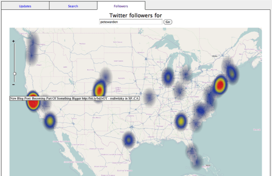
I've always wanted to know where the people who follow me on Twitter are from, both out of curiosity and so I can connect with them as I travel around the country. To find out, I built a tool using OpenHeatMap to visualize your followers by location. It only shows followers who have been active recently, but I've had great fun discovering connections to Ghangzhou, Prague and even the exotic, enigmatic country of Canada, little known to westerners.

There's actually three different views you can use to explore Twitter as a map. You can put in your own or someobody else's handle to see their active followers, you can visualize the updates from the people you follow, or do a search on a keyword and see where in the world people are talking about that topic.

It's still just a prototype, but it feels like a step towards the interface we need to make sense of the flood of location data that's flowing all around us. I look forward to hearing your ideas on improving it, and since the component is completely open-source, feel free to build your own to show me how it should really be done!

OpenHeatMap for journalists

I’ve long admired The Guardian’s innovative approach to opening up their data, so I was very excited to see their technology editor, Charles Arthur, using it on a recent story. I was happily surprised that he was able to set up his map without ever contacting me. I’ve always intended it to be self-serve but that can be very hard to achieve with a completely new product.

Since I’m really keen to see the stories other reporters can tell with OpenHeatMap, I’ve created a four minute video guide aimed at journalists that walks you through exactly what you need to do to build your own maps. If you have some information about places, I’ve made it drop-dead simple to create a map that tells your story, so please check the guide out out and pass it along to any other folks who might be interested.

Free bulk geocoding for US addresses

Mappins
Photo by Chris Blakeley

My goal with OpenHeatMap is to have the computer handle all of the messing around that’s usually required to load data into a GIS system. I want to accept anything that describes a location, rather than forcing users to spend endless time massaging their input data.

This is fairly straightforward with country names, zip codes, and even US county names, but I’ve struggled to find a good solution for turning addresses into latitude, longitude positions. All of the free APIs out there are either very accurate but have crippling limits on how often you can call them, or are unlimited but with very low precision. The going rate for commercial geocoding is $10 per thousand addresses, which ruled that right out!

Happily I’ve found a solution. Schuyler Erle and Jo Walsh created an open-source Perl module a few years ago called Geo-Coder-US. It uses the public-domain Tiger/Line data from the US census to look up American addresses. In my tests of the online version it was remarkably accurate (much better than OpenStreetMap’s Nominatim for example) though the authors warn that rural coverage is not as good. The only downside was that the actual database file to accompany the code was too large for the authors to host, so I had to spend some time digging around the census FTP site to find the right source files, download all 9 GB of them and then run the database creation which took several hours.

To save anyone else from having to go through the same struggle, I’ve uploaded a version of the project to github that contains the compiled database file. Be warned, the database is almost a gigabyte in size, so it’s not a quick download! You may also need to install Geo-Coder-US-1.00.tar.gz via cpan to grab all the dependencies. Once you have it, cd into the directory and try running

eg/lookup.pl “2543 Graystone Pl, Simi Valley, CA 93065”

You should see the following output:

“2543 Graystone Pl, Simi Valley, CA 93065”, 34.280874, -118.766207

You can either pass multiple addresses as command line arguments, or pipe a file to the script and it will treat each line as an address and output as CSV. The original authors also include a SOAP server script for Perl, so you could also run this as a web service. I’m going to be moving OpenHeatMap to using this, so look out for more accurate address locations, at least for American data.

A big thanks to Schuyler and Jo for making this code available in the first place, do keep them in mind for any location consulting work you might have.

Clapham is a hole, and other curiosities of the London Underground

I never lived in London, but my Gran was born within sound of the Bow Bells and I’ve spent enough time there to know how important the London Underground network is. The distance as the crow flies is far less important than how accessible the start and destination of any journey are by Tube. I’ve always wondered how the city would look if you could see how far everywhere was from a station, so I grabbed a list of the locations (compiled by OpenStreetMap volunteers) and uploaded them to OpenHeatMap. A few surprises leapt out at me:

Clapham is a hole

Claphamhole2

Clapham Junction is one of the busiest above-ground stations in the world, but it’s nearly a mile and a half to the nearest Underground line. The whole area is a big, gaping hole in the coverage of the network, and you have to wonder if some nameless Tube planner had it in for the place?

It’s Grim Down South

Southunderground

There’s a lot more lines north of the river than in South London. I have no idea why, but I know I want a direct line to Chessington for when I’m visiting my Grandad (and no, he’s not in the World of Adventure!)

Tubes-end

Chesham

Though the map of the Underground has all the elegance of a fly on a windshield, I was intrigued by a few of the feelers shooting out across the landscape. Chesham is the furthest ‘underground’ station from central London, though it doesn’t appear very subterranean to me. On the far north-west of the map, in the wild, howling wasteland of Buckinghamshire, it has the fewest visitors of any station in the network, but does have the distinction of being the most popular starting point for the Tube Challenge. Thanks to Wikipedia, I’ve learned that this involves trying to beat the Guinness World Record for visiting all 270 Tube stations in the shortest possible time. Apparently this has been going on for decades (1979 to 2000 was the ‘Bob Robinson Era’) but recently advanced computing techniques have been used to find more and more optimal routes.

I really do miss Britain sometimes, no other nation comes close to our skill at finding wonderfully creative ways to waste time. Now I need to get back to my game of Mornington Crescent…

OpenHeatMap launches

Screenshot6

I learned a lot from my Five Nations of Facebook post, but the biggest lesson was how good maps are at telling complicated stories in a simple way. It left me wanting to build more of them, but I didn't want to code up a whole new piece of software for each one. I spent some time looking around for some applications to help me build online interactive maps, but couldn't find any that met my needs. So, I set out to build the tools I wished I had.

Six months later, I'm finally launching the first public release of OpenHeatMap. What is it? For a quick answer check out the gallery, but the long version is that there's two sides, a service for users and an open-source framework for developers. Here's what each offers.

For Users

My one-sentence description is "YouTube for maps". If you have location data in an Excel spreadsheet, you can save it out as a CSV file, upload it to OpenHeatMap and get an interactive online map that you can customize, share and embed.

For Developers

OpenHeatMap is a JQuery plugin for embedding maps in your page. It will render in either Flash or Canvas to work across as many platforms as possible. I've licensed it under the GPL, the code is on github, and all of the data sources are under open-source licenses, so you should be able to use it without any of the pesky terms-of-service restrictions that come with some of the commercial solutions.

I'm still working like crazy to iron out bugs and improve the service (trying to get it working a lot more reliably on the iPhone for example), so please give it a try and let me know what you think via pete@mailana.com. I'll be blogging about some of my favorite maps over the next few days, so let me know if you create some that you'd like to share as well.

And finally a big thanks to everyone who's helped me get the project this far, all of the pre-release testing and feedback from my regular readers was incredibly helpful. In particular I'd like to thank:

Steve Coast for giving me the initial drunken shove towards building this

Peter Batty for educating a newbie on the geo world

Michal Migurski for creating so many awesome maps, and giving early feedback

Dan Armstrong for insightful guidance on what data analytics professionals like him really need

Joe Kelly and Chris Hathaway for generously sharing some fascinating data sets

Josh, Rob and Jud for their constant support and testing help

Five short links

Lakegranby
(I’m just back from a two-night camping trip at Lake Granby high in the Rockies, and that’s a view from our site)

How to nurture data scientists – There’s a whole new generation of data geeks quietly emerging who don’t fit in with the traditional classifications and Ben covers what they need to thrive within an organization. “The web is awash with data, much of which might be useful for your business analysis if you had a team of data scientists”

WhereDoYouGo – A fascinating open-source project to map your FourSquare habits via @rgaidot

Getting started with Map ReduceScott Hendrickson saved my bacon at the last Boulder/Denver Hadoop meetup. I’d left the location and talk arrangements until the last minute but he came through with a killer beginners guide to Amazon’s Elastic MapReduce service. He’s uploaded the slides here, and though his narration was hilarious, even just the notes and the links he includes are valuable for anyone thinking of using Hadoop

AggData – What is it with Texas and data startups? I’m already a big fan of 80Legs and InfoChimps, and just discovered this source of data sets in the Lone Star state. What’s really interesting is that it’s all publicly available information, with a lot of store locations pulled from websites, but it’s hard to gather unless you’re willing to do some serious head-scratching writing your own crawlers.

Rent-a-treehouse – I don’t normally respond to SEO people who want me to promote their sites, but when Chris Horner emailed me I was actually pretty fascinated by these odd European vacation rentals, so I decided to pass them along for free. You could also have your pick of a couple of castles, a shepherd’s hut or even a cave.

Five short links

Fifthelement
Picture by Esther Kirby

Cybercasing the Joint: On the Privacy Implications of Geo‐Tagging – A thought-provoking paper that looks at the real-world security holes that the new streams of location information create. A great example is the coordinates silently embedded in many photos – if you post a picture of a valuable item to Craigslist then anyone could work out where you live, and so where to steal it from

Free GIS Data – A small but useful collection of geographic data sets. This together with the world boundaries at Thematic Mapping opens up a lot of possibilities for geographic visualizations

Heat maps with the Google Flash API – This tutorial walks you through the coding steps you need to create your own thematic maps

Should BP nuke its leaking well? – After spending a childhood so convinced a nuclear apocalypse was imminent that I used to refuse to go into town with my parents, I’ve retained a fascination with the weapons, so I was glad to see an in-depth analysis of this idea. My favorite quote by far is “I would recommend that the international community not listen to the Russians. Especially those of them that offer crazy ideas. Russians are keen on offering things, especially insane things.”

A phone call from the census – I wonder is this is the equivalent of a Rorschach blot for your attitude to name-badge employees? Erik Gordon seems baffled by the fact that the census employee calling him has to rigidly stick to a script as she checks the census details he’d mailed in, and gets self-righteously stroppy. Reading it as someone who was forced to ask “Would you like cashback?” to every single customer at my checkout no matter how inappropriate it seemed or risk getting fired, I just feel bad for the girl who’s calling. Spending a bit of time on the bottom rungs of companies with that level of hyper-controlled process makes you look at these encounters differently.