Is ‘journalizing’ the future of journalism?

Presspass
Photo by MacWagen

Stowe Boyd just posted about a new program specializing in 'Entrepreneurial Journalism' at CUNY, and I got excited because I thought it was going to focus on strange folks like me who combine building companies and writing stories. I was disappointed to see that it's actually just a traditional course for producing professional journalists, with just a bit of lipstick added. So what's my big idea?

I spend a lot of my time working on articles that look awfully like newspaper or magazine stories. I've had those articles excerpted and discussed on places like the New York Times site, NPR and The Atlantic. I do original research, including picking up the phone and calling people. Despite all this I don't consider myself a journalist, nor do I particularly want to be called one. Everything I'm doing is driven by a combination of my own curiosity and the benefits that publicity brings to my startup work.

In the twentieth century, journalism became professionalized and turned into something you are instead of something you do. This had a lot of benefits in an age where the means of distribution were concentrated in a handful of editors' hands – notably it enforced norms of behavior that restrained reporters from abusing the great power they possessed.

These days there's much more of a continuum of people who produce articles that look, smell and feel like journalism to their readers. Are these part-time creators journalists? That term's the cause of far too many arguments, as the professionals feel offended at the devaluing of their own hard-earned credentials and the part-timers at the denial that their work is worthwhile. I think it's much more productive to return to talking about journalism as something you do, not something you are. Since I'm practically American now (two years until I can convert my green card into a passport!) I felt I should coin a neologism to join 'deplane' and other horrid barbarities, so from now on I'll be talking about my journalizing.

If journalizing is seen as much more of a skill that ordinary people can learn to varying levels, then maybe we can escape the loggerheads of journalists-versus-bloggers arguments. Do paramedics bitch and moan about people learning first aid and devaluing their jobs? Hell no, my most recent class was even taught by one volunteering in his spare time!

In the last few years that I've spent blogging, I've gained so much respect for the people who can produce streams of well-written articles for a deadline, year after year. Maybe if more people had hands-on experience of the work that it takes, it would actually be a better world for professional journalists?


Five short links – Turbo Encabulator edition

Highfive
Photo by Joachim S Mueller

EXHIBIT – This lightweight library for creating visualizations by harvesting data embedded in pages looks like a great way of encouraging people to add semantic structure to their HTML. Which is good for me, since it makes my crawling a lot easier. Via Carole Goble

Outwit – I can't find much out about these folks, but it looks like a step towards the simple unstructured data parsing tool I was just dreaming about. Via Conrad Quilty-Harper

ScraperWiki – Another find from my search for better scraping tools, what impresses me about this site is their active community. There's been a lot of attempts at bringing tools like this to the masses, but I'm hopeful the time is right for this one to succeed. Via Dan Armstrong

AddToIt – An enterprise take on converting unstructured text into useful information. There's a whole quiet world of commercial companies offering scraping services, which is partly what gives the field a shady reputation. Their promise to handle cases where "The data you would like to scrape is protected" certainly adds to that impression. That's a shame, because I bet there's a lot of interesting technology behind these approaches that will never see the light of day.

Turbo Encabulator – This is probably what I sound like when I talk to normal people about my day at work. A games artist friend would always mutter 'glib-glob.cpp' when I started to get too jargonified, after a source code file name I mentioned once that caused him to go into hysterics. Hey, it's a GameLIBrary-GLOBals C Plus Plus module, made sense to me! After they caused most of our early Motion bugs, 'Pbuffers' became a shorthand codeword for technical nonsense talk in our team at Apple, since they sounded so made up but were the engineer's explanation for everything that went wrong.

The missing tool for data scientists?

Plowwrench
Photo by Noel C Hankamer

I'm flying back from a preparatory meeting for Strata, and as always with the O'Reilly events it left my mental cogs whirring. One of the biggest revelations for me was that every single person was using the equivalent of string and chicken wire to build their analysis pipeline, from OKCupid analysts to folks helping the New York Times. As Hilary Mason put it, are we stuck just using grep and awk? This was actually a massive relief for me as I've always been highly embarassed by the hacky code that's behind most of my data pipelines and assumed that I was just ignorant and didn't know the right tools! Though R got an honorable mention from several attendees, almost everyone just picked their favorite scripting language, then cut-and-pasted code and shell commands to get the job done.

The fundamental reason for this is the aptly named 'suffering' phase of data munging where we transform raw HTML pages, JSON, text, CSV, XML, legacy binary or any other semi-structured format into strictly arranged data that we can then run through standard analysis tools. It turns out that (apart from the binary formats) this means writing regular expressions with a thin veneer of logic glueing them together. You can see an example of that in my crawler that gathers school ranking data from the LA Times. There's a single massive regex at the top of the file that contains a group for each piece of data I want to gather. Using PHP to pull the HTML, I match against the raw text, grab out the contents of each group and write them out as a row to a CSV file. My Buzz profile crawler uses the same idea, but with a much more complex set of regexes. To convert unemployment data files I use a similar approach on the strange text file format the BLS uses.

After spending so long building all this throwaway code, I think I know the tool I want. It would let me load a large data set into an interactive editor. I'd then highlight a series of 'records' that would each be transformed into a row in the output CSV file. It would automagically figure out a good regex that matched all the records but none of the intervening filler text. Then you'd select the text that represented the values for each record, the numbers or strings you'd expect to see in each column of the CSV output. By selecting equivalent values in three or four records, the tool could build nested regexes or groups that extracted them from each record. As I was doing all this, I'd see a sample of the results show up in a sidebar pane. I'd be able to hand-tweak the underlying regular expressions driving each part too, and see how the matches change.

This sounds a lot like something you could build into Emacs (but then anything sounds a lot like something you could build into Emacs). I have no experience creating extensions though, so I'd love to know if there's anything already out there, in any environment? It doesn't have to do everything I'm after, just an interactive grep a little more advanced than control-S in Emacs would be an interesting step forward compared to running it all from the command line. Is anybody aware of anything like that? Is there a completely different approach I'm missing?

Is London the greenest place in England?

http://www.openheatmap.com/view.html?map=IncisoryPetromyzontSphaeriaceae

I was helping Tony Hirst get up-and-running with OpenHeatMap when I first ran across the Guardian's analysis of data on CO2 emissions across the UK. What leapt out at me was how little London was pumping out. Almost every borough is producing around 4 or 5 tonnes per person, and nowhere else in the country other than the Highlands can beat that. Northumberland manages to produce 18 tonnes for every inhabitant!

There are some anomalies, the City of London and Westminster are off the charts because there's so few people who count as living there despite a massive daily influx, and I wonder how much of Kent's output is related to supplying London's neeeds. The overall picture is clear though – if you want to reduce your carbon emissions, the city is the place to go. I vaguely knew this already, but the difference here was eye-popping. It turns out that encouraging denser development to reduce the impact on the environment is gaining ground as an idea, but seeing the difference so starkly makes me think twice about my choices.

Here's an Excel spreadsheet with the raw data, ready to upload into OpenHeatMap if you want to see the full details. I'm no environmental scientist, so what do you think? Am I missing something, or should we all flee to the cities?

Netezza shows there’s more than one way to handle Big Data

Alternativeroute
Photo by Nick Dimmock

As you may have noticed I'm a strong advocate of MapReduce, Hadoop and NoSQL, but I'm not blind to their limits. They're perfect for my needs primarily because they're dirt-cheap. There's no way on God's earth I could build my projects on enterprise systems like Oracle, the prices are just too high. The trade-off I make is that I spend a lot of my own time on learning and maintenance, whereas a lot of the cost of commercial systems reflects the support companies receive, so they don't need their own employees to geek out like that.

Another thread has been the relatively poor price/performance ratio of standard SQL databases when it comes to terabytes of data. That's where Netezza has been interesting, and today's announcement that they were being acquired by IBM highlighted how much success they've had with their unique approach.

The best way to describe Netezza's architecture was that they built the equivalent of graphics cards, but instead of being focused on rendering they worked at the disk controller level to implement common SQL operations as the data was being loaded from the underlying files, before it even reached the CPU. As a practical example, instead of passing every row and column from a table up to main system memory, their FPGA-based hardware has enough smarts to weed out the unneeded rows and cells and upload a much smaller set for the CPU to do more complex operations on. For more information, check out Curt Monash's much more in-depth analysis.

Why does this matter? This completely flies in the face of the trend towards throwing a Mongolian horde of cheap commodity servers at Big Data problems in the way that Google popularized. It also suggests that there might be another turn of the Wheel of Reincarnation about to get started. These happen when a common processing problem's requirements outstrip a typical CPU's horsepower, and the task is important enough that it becomes worthwhile to build specialized co-processors to handle it. CPU power then increases faster than the problem's requirements, and so eventually the hardware capability gets folded back into the main processor. The classic example from my generation is the Amiga-era graphics blitters for 2D work which got overwhelmed by software renderers in the 90's, but were then reincarnated as 3D graphics cards.

At the moment we're in the 'Everything on the CPU with standard hardware' trough of the wheel for Big Data processing, but with Google hinting at limits to its MapReduce usage, maybe we'll be specializing more over the next few years?

OpenHeatMap expands to Ireland

Irishscreenshot

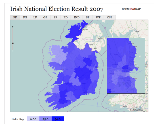
Thanks to some dedicated work from Steve White and Ben Raue's creative-common's licensed release of the boundaries, now you can visualize counties and constituencies in the Republic of Ireland. Steve's already dived into mapping both general election results and the Lisbon referendum, and I have the 2012 electoral boundaries prepared too.

Would you like your country added to OpenHeatMap? Drop me an email and I'll get on the case!

Calling all Boston and New York data geeks

Nypd
Photo by Marcos Vasconcelos

I'm flying out to the East Coast next weekend and have some gaps in my schedule. I'm attending a planning meeting for the upcoming Strata O'Reilly conference, and I would love to get thoughts on sessions from other data geeks. So if you're free in downtown Boston at 2pm on Friday September 24th, or in Manhattan at 3pm on Monday September 27th, and you're interested in Big Data and visualizations, drop an email to pete@mailana.com and I'll send you the meetup details.

Five short links

Fivestar
Photo by Andreas

Mapumental – A really useful visualization that promises to help you find the ideal place to live, letting you interact and question the data in an intuitive way. This is exactly why I built OpenHeatMap, an interactive data map opens up so many possibilities. Now I’m eagerly awaiting the live product.

Guide to finding a technical co-founder – Vinicius’s guide rings very true to me, and most of his points also apply to finding a business co-founder if you’re technical. The short story is, it’s hard. Really hard. I spent a lot of time and effort on the hunt, and still failed. It will help a lot if you’re flexible about what you want to work on, then you might get lucky at co-founder dating events or via other random connections. My biggest regret is that I didn’t set myself a deadline, I kept at it long after I should have given up on the search and either dropped my idea or focused on getting traction instead (which is what I eventually ended up doing).

7,000 Neighborhood shapefiles – I only just came across this resource from Zillow, it’s incredibly handy who wants to talk a geographic language that users understand. We all talk about neighborhoods in our daily life, but this is the only open resource I’ve found that gives you definitions you can use.

Who is the greatest diva of the last 25 years? – I love this mostly because of the brutally honest description of their methodology (“We used computers!”). Truth be told, most of the visualizations you’ll see on the web don’t have much more behind them either, including some of mine on a bad day. Always try to look beyond the veneer of authority that charts and infographics give to any argument.

Twitter contour maps – Talking of substance before style, here’s a spartan visualization with some great data and ideas behind it. I’m looking forward to the next version of Twitterplaces from Ben, he’s digging deep in some interesting territory.

OpenHeatMap now visualizes Canada and Mexico

Canadascreenshot
http://www.openheatmap.com/view.html?map=PentaptychWardererIdioticalness

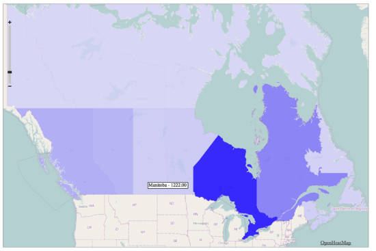
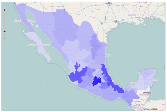
After the UK, the most-requested countries for OpenHeatMap have been Canada and Mexico, so I'm pleased to launch state/province level coverage for both of them. All you need to do is create either a Canadian province or Mexican state column in your spreadsheet and I'll take care of the rest!

Unfortunately I haven't been able to find more detailed information for either country, I'd love to find electoral boundaries for both, but I'll keep looking. I also have leads on Turkey, Australia, New Zealand, Germany, Austria, Switzerland and Ireland, so I hope I can cover even more of the world.

If you don't want a thematic map, and are happy with blobby heatmaps instead of filled polygons, you can already use OpenHeatMap with international street addresses, just put them in an address column.

Mexicoscreenshot
http://www.openheatmap.com/view.html?map=TheodramaProctologicApogeny

OpenHeatMap now visualizes the UK

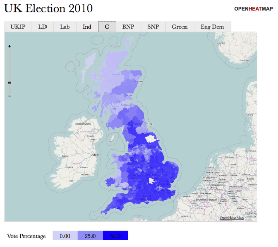
I've had a lot of requests from friends in the old country wanting to use OpenHeatMap to display data about areas in the United Kingdom. After quite some time wrestling with the Ordnance Survey's recent release of open data I'm pleased to announce that you can now visualize everything from counties to constituencies to council districts! To celebrate, I've created a visualization of the recent election, showing the percentage of the vote that each party received in every constituency:

Ukelectionshot

To go along with it, I've put together a quick 'making of' video tutorial, showing how it only takes a couple of minutes to transform the Guardian's spreadsheet of election data into an interactive map:

I just want to say a big thanks to everyone who helped me gather this data, especially Matthew Somerville of MySociety who went above and beyond to help me understand counties, Simon Rogers for making the election data freely available, along with Cameron Neylon, Colin McCrory, Chris McCray, Leigh Dodds, Bill Roberts, John Goodwin, Richard Stirling and Laura Oliver.

Do you wish you could visualize data about regions of your country? Drop me an email and I'll see what I can do (and maybe rope you in to investigate if your government makes the data openly available!)