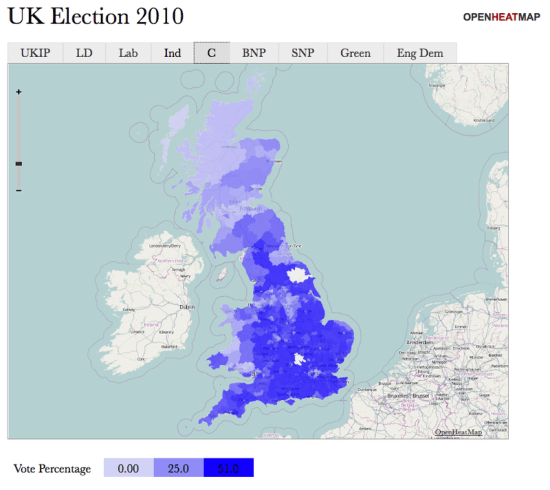
I've had a lot of requests from friends in the old country wanting to use OpenHeatMap to display data about areas in the United Kingdom. After quite some time wrestling with the Ordnance Survey's recent release of open data I'm pleased to announce that you can now visualize everything from counties to constituencies to council districts! To celebrate, I've created a visualization of the recent election, showing the percentage of the vote that each party received in every constituency:
To go along with it, I've put together a quick 'making of' video tutorial, showing how it only takes a couple of minutes to transform the Guardian's spreadsheet of election data into an interactive map:
I just want to say a big thanks to everyone who helped me gather this data, especially Matthew Somerville of MySociety who went above and beyond to help me understand counties, Simon Rogers for making the election data freely available, along with Cameron Neylon, Colin McCrory, Chris McCray, Leigh Dodds, Bill Roberts, John Goodwin, Richard Stirling and Laura Oliver.
Do you wish you could visualize data about regions of your country? Drop me an email and I'll see what I can do (and maybe rope you in to investigate if your government makes the data openly available!)
