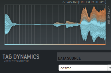
… is animation! I haven’t seen this used in any commercial sites, but Moritz Stefaner has a flash example of an animated cloud from his thesis. You should check out his other work there too, it includes some really innovative ways of displaying tags over time, like this graph showing tag usage:

His thesis title is "Visual tools for the socio-semantic web", and he really delivers 9 completely new ways of displaying the data, most of them time-based. Even better, he has interactive and animated examples online for almost all of them. Somebody needs to hire him to develop them further.
Moritz has his own discussion on the motivations and problems with animated tag clouds. For my purposes, I want to give people a way to spot changes in the importance of email topics over time. Static tag clouds are great for showing the relative importance of a large number of keywords at a glance, and animation is a way of bringing to life the rise and decline of topics in an easy to absorb way. Intuitively, a tag cloud of words in the subjects of emails would show ‘tax’ suddenly blinking larger in the US in April. On a more subtle level, you could track product names in customer support emails, and get an idea of which were taking the most resources over time. Trying to pull that same information from the data arranged as a line graph is a lot harder.
There’s some practical problems with animating tag clouds. Static clouds are traditionally arranged with words abutting each other. This means when one changes size, it affects the position of all the words after it. This gives a very distracting effect. One way to avoid this is to accept some level of overlap between the words as they change size, which makes the result visually a lot more cluttered and hard to read. You can increase the average separation between terms, which cuts down the overlap, but does result in a lot sparser cloud.
I’m interested in trying out some other arrangement approaches. For example, I’m fond of the OS X dock animation model, where large icons do squeeze out their neighbors, but in a very unobtrusive way. I’m also hopeful there’s some non-flash ways to do this just with JavaScript.
