… is time. A mail store is one of the few sources of implicit data that has intrinsic time information baked in. The web has a very spotty and unreliable notion of time. In theory you should be able to tell when a page was last modified, but in practice this varies based on sites, and there’s no standard way (other than wayback) to look at the state of sites over an arbitrary period.
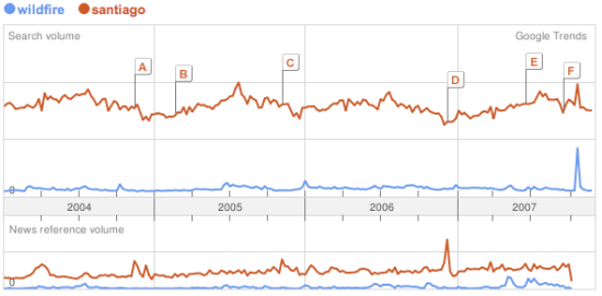
Once you’ve extracted keywords, it’s possible to do something basic like Google Trends. Here’s an example showing frequency of searches for Santiago and Wildfire:
A friend suggested something similar for corporate email; it would be good to get a feel for the mood of the company based on either common keywords, or some measure of positive and negative words in messages. This could be tracked over time, and whilst it would be a pretty crude measure, could be a good indicator of what people are actually up to. Similarly, pulling out the most common terms in search queries going through the company gateway would give an insight into what people are thinking and working on. There’s privacy concerns obviously, but the aggregation of data from a lot of people makes it a lot more anonymous and less invasive. Its harder to turn the beefburger back into a cow, the combined data is a lot less likely to contain identifying or embarassing information.
Similar to Google’s trends, but with more information and better presentation is Trendpedia. Here’s a comparison of Facebook, MySpace and Friendster over time:
So far, the examples have all been of fairly standard line graphs. There’s some intriguing possibilities once you start presenting discrete information on a timeline, and allowing interaction and exploration, especially with email. Here’s an example of a presidential debate transcript with that sort of interface, from Jeff Clark:
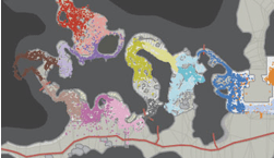
All of these show a vertical, one-dimensional slice of information as it changes over time. It’s also possible to indicate time for two-dimensional data. The simplest way is to accumulate values onto a plane over time, so you can see how much of the time a certain part was active. Here’s an example from Wired, showing how player location over time was plotted for Halo maps to help tweak the design:

What’s even more compelling is showing an animation of 2D data as it changes over time. The downside is that it’s a lot harder to implement, and I don’t know of too many examples. TwitterVision is one, but it’s not too useful. Mostly these sort of animations have to be client-side applications. For email, showing the exchange of messages over time on a graph is something that could give some interesting insights.
Thanks to Matthew Hurst for pointing me to a lot of these examples through his excellent blog.