 Photo by Lisha Li
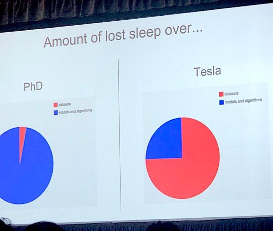
Andrej Karpathy showed this slide as part of his talk at Train AI and I loved it! It captures the difference between deep learning research and production perfectly. Academic papers are almost entirely focused on new and improved models, with datasets usually chosen from a small set of public archives. Everyone I know who uses deep learning as part of an actual application spends most of their time worrying about the training data instead.
There are lots of good reasons why researchers are so fixated on model architectures, but it does mean that there are very few resources available to guide people who are focused on deploying machine learning in production. To address that, my talk at the conference was on “the unreasonable effectiveness of training data”, and I want to expand on that a bit in this blog post, explaining why data is so important along with some practical tips on improving it.
As part of my job I work closely with a lot of researchers and product teams, and my belief in the power of data improvements comes from the massive gains I’ve seen them achieve when they concentrate on that side of their model building. The biggest barrier to using deep learning in most applications is getting high enough accuracy in the real world, and improving the training set is the fastest route I’ve seen to accuracy improvements. Even if you’re blocked on other constraints like latency or storage size, increasing accuracy on a particular model lets you trade some of it off for those performance characteristics by using a smaller architecture.
Speech Commands
I can’t share most of my observations of production systems, but I do have an open source example that demonstrates the same pattern. Last year I created a simple speech recognition example for TensorFlow, and it turned out that there was no existing dataset that I could easily use for training models. With the generous help of a lot of volunteers I collected 60,000 one-second audio clips of people speaking short words, thanks to the Open Speech Recording site the AIY team helped me launch. The resulting model was usable, but not as accurate as I’d like. To see how much of that was to do with my own limitations as a model designer, I ran a Kaggle competition using the same dataset. The competitors did much better than my naive models, but even with a lot of different approaches multiple teams came to within a fraction of a percent of 91% accuracy. To me this implied that there was something fundamentally wrong with the data, and indeed competitors uncovered a lot of errors like incorrect labels or truncated audio. This gave me the impetus to focus on a new release of the dataset with the problems they’d uncovered fixed, along with more samples.
I looked at the error metrics to understand what words the models were having the most problems with, and it turned out that the “Other” category (when speech was recognized, but the words weren’t within the model’s limited vocabulary) was particularly error-prone. To address that, I increased the number of different words that we were capturing, to provide more variety in training data.
Since the Kaggle contestants had reported labeling errors, I crowd-sourced an extra verification pass, asking people to listen to each clip and ensure that it matched the expected label. Because Kaggle had also uncovered some nearly silent or truncated files, I also wrote a utility to do some simple audio analysis and weed out particularly bad samples automatically. Finally, I increased the total number of utterances to over 100,000, despite removing bad files, thanks to the efforts of more volunteers and some paid crowd-sourcing.
To help others use the dataset (and learn from my mistakes!) I wrote everything relevant up in an Arxiv paper, along with updated accuracy results. The most important conclusion was that, without changing the model or test data at all, the top-one accuracy increased by over 4%, from 85.4% to 89.7%. This was a dramatic improvement, and was reflected in much higher satisfaction when people used the model in the Android or Raspberry Pi demo applications. I’m confident I would have achieved a much lower improvement if I’d spent the time on model adjustments, even though I’m currently using an architecture that I know is behind the state of the art.
This is the sort of process that I’ve seen produce great results again and again in production settings, but it can be hard to know where to start if you want to do the same thing. You can get some idea from the kind of techniques I used on the speech data, but to be more explicit, here are some approaches that I’ve found useful.
First, Look at Your Data
It may seem obvious, but your very first step should be to randomly browse through the training data you’re starting with. Copy some of the files onto your local machine, and spend a few hours previewing them. If you’re working with images, use something like MacOS’s finder to scroll through thumbnail views and you’ll be able to check out thousands very quickly. For audio, use the finder to play previews, or for text dump random snippets into your terminal. I didn’t spend enough time doing this for the first version speech commands which is why so many problems were uncovered by Kaggle contestants once they started working with the data.
I always feels a bit silly going through this process, but I’ve never regretted it afterwards. Every time I’ve done it, I’ve discovered something critically important about the data, whether it’s an unbalanced number of examples in different categories, corrupted data (for example PNGs labeled with JPG file extensions), incorrect labels, or just surprising combinations. Tom White has made some wonderful discoveries in ImageNet using inspection, including the “Sunglass” label actually referring to an archaic device for magnifying sunlight, glamor shots for “garbage truck”, and a bias towards undead women for “cloak”. Andrej’s work manually classifying photos from ImageNet taught me a lot about the dataset too, including how hard it is to tell all the different dog breeds apart, even for a person.
What action you’ll take depends on what you find, but you should always do this kind of inspection before you do any other data cleanup, since an intuitive knowledge of what’s in the set will help you make decisions on the rest of the steps.
Pick a Model Fast
Don’t spend very long choosing a model. If you’re doing image classification, check out AutoML, otherwise look at something like TensorFlow’s model repository or Fast.AI’s collection of examples to find a model that’s solving a similar problem to your product. The important thing is to begin iterating as quickly as possible, so you can try out your model with real users early and often. You’ll always be able to swap out an improved model down the road, and maybe see better results, but you have to get the data right first. Deep learning still obeys the fundamental computing law of “garbage in, garbage out”, so even the best model will be limited by flaws in your training set. By picking a model and testing it, you’ll be able to understand what those flaws are and start improving them.
To speed up your iteration speed even more, try to start with a model that’s been pre-trained on a large existing dataset and use transfer learning to finetune it with the (probably much smaller) set of data you’ve gathered. This usually gives much better results than training only on your smaller dataset, and is much faster, so you can quickly get a feel for how you need to adjust your data gathering strategy. The most important thing is that you are able to incorporate feedback from your results into your collection process, to adapt it as you learn, rather than running collection as a separate phase before training.
Fake It Before You Make It
The biggest difference between building models for research and production is that research usually has a clear problem statement defined at the start, but the requirements for real applications are locked inside users heads and can only be extracted over time. For example, for Jetpac we wanted to find good photos to show in automated travel guides for cities. We started off asking raters to label a photo if they considered it “Good”, but we ended up with lots of pictures of smiling people, since that’s how they interpreted the question. We put these into a mockup of the product to see how test users reacted, and they weren’t impressed, they weren’t inspirational. To tackle that, we refined the question to “Would this photo make you want to travel to the place it shows?”. This got us content that was a lot better, but it turned out that we were using workers in south-east asia who thought that conference photos looked amazing, full of people with suits and glasses of wine in large hotels. This mismatch was a sobering reminder of the bubble we live in, but it was also a practical problem because our target audience in the US saw conference photos as depressing and non-aspirational. In the end, the six of us on the Jetpac team manually rated over two million photos ourselves, since we knew the criteria better than anyone we could train.
This is an extreme example, but it demonstrates how the labeling process depends heavily on the application’s requirements. For most production use cases there’s a long period of figuring out the right question for the model to answer, and this is crucial to get right. If you’re answering the wrong question with your model, you’ll never be able to build a solid user experience on that poor foundation.
 Photo by Thomas Hawk
The only way I’ve found to tell if you are asking the right question is to mock up your application, but instead of having a machine learning model have a human in the loop. This is sometimes known as “Wizard-of-Oz-ing”, since there’s a man behind the curtain. In the Jetpac case, we had people manually choose photos for some sample travel guides, rather than training a model, and used feedback from showing test users to adjust the criteria we used for picking the pictures. Once we were reliably getting positive feedback from the tests, we then transferred the photo choosing rules we’d developed into a label playbook for going through millions of images for the training set. This then trained the model that was able to predict quality for billions of photos, but its DNA came from those original manual rules we developed.
Train on Realistic Data
With Jetpac the images we used for training our models were from the same sources (largely Facebook and Instagram) as the photos we wanted to apply the models too, but a common problem I see is that the training dataset is different in important ways from the inputs a model will eventually see in production. For example, I’ll frequently see teams that have a model trained on ImageNet hitting problems when they try to use it in a drone or robot. This happens because ImageNet is full of photos taken by people, and these have a lot of properties in common. They’re shot with phones or still cameras, using neutral lenses, at roughly head height, in daylight or with artificial lighting, with the labeled object centered and in the foreground. Robots and drones use video cameras, often with high field-of-view lenses, from either floor level or from above, with poor lighting, and without intelligent framing of any objects so they’re typically cropped. These differences mean that you’ll see poor accuracy if you just take a model trained on photos from ImageNet and deploy it on one of those devices.
There are also more subtle ways that your training data can diverge from what your final application will see. Imagine you were building a camera to recognize wildlife and used a dataset of animals around the world to train on. If you were only ever going to deploy in the jungles of Borneo, then the odds of a penguin label ever being correct are astronomically low. If Antarctic photos were included in the training data, then there will be a much higher chance that it will mistake something else for a penguin, and so your overall error rate will be worse than if you’d excluded those images from training.
There are ways to calibrate your results based on known priors (for example scale penguin probabilities down massively in jungle environments) but it’s much easier and more effective to use a training set that reflects what the product will actually encounter. The best way I’ve found to do that is to always use data captured directly from your actual application, which ties in nicely with the Wizard of Oz approach I suggested above. Your human-in-the-loop becomes the labeler of your initial dataset, and even if the number of labels gathered is quite small, they’ll reflect real usage and should hopefully be enough for some initial experiments with transfer learning.
Follow the Metrics
When I was working on the Speech Commands example, one of the most frequent reports I looked at was the confusion matrix during training. Here’s an example of how that’s shown in the console:
[[258 0 0 0 0 0 0 0 0 0 0 0]
 [ 7 6 26 94 7 49 1 15 40 2 0 11]
 [ 10 1 107 80 13 22 0 13 10 1 0 4]
 [ 1 3 16 163 6 48 0 5 10 1 0 17]
 [ 15 1 17 114 55 13 0 9 22 5 0 9]
 [ 1 1 6 97 3 87 1 12 46 0 0 10]
 [ 8 6 86 84 13 24 1 9 9 1 0 6]
 [ 9 3 32 112 9 26 1 36 19 0 0 9]
 [ 8 2 12 94 9 52 0 6 72 0 0 2]
 [ 16 1 39 74 29 42 0 6 37 9 0 3]
 [ 15 6 17 71 50 37 0 6 32 2 1 9]
 [ 11 1 6 151 5 42 0 8 16 0 0 20]]
This might look intimidating, but it’s actually just a table showing details about the mistakes the network is making. Here’s a labeled version that’s a bit prettier:
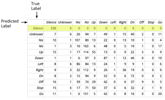
Each row in this table represents a set of samples where the actual true label is the same, and each column shows the numbers for the predicted labels. For example the highlighted row represents all of the audio samples that were actually silent, and if you read from left to right, you can see that the predicted labels for those were correct, with every one falling in the column for predicted silence. What this tells us is that the model is very good at correctly spotting real silences, there are no false negatives. If we look at the whole column, showing how many clips were predicted to be silence, we can see that some clips that were actually words were mistaken for silence, with quite a few false positives. This turned out to be helpful to know, because it caused me to look more closely at the clips that were mistakenly being classified as silence, and a lot of them were unusually quiet recordings. That helped me improve the quality of the data by removing low-volume clips, which I wouldn’t have known to do without the clue from the confusion matrix.
Almost any kind of summary of the results can be useful, but I find the confusion matrix to be a good compromise that gives more information than a single accuracy number but doesn’t overwhelm me with too much detail. It’s also useful to watch the numbers change during training, since it can tell you what categories the model is struggling to learn, and give you areas to concentrate on when cleaning and expanding your dataset.
Birds of a Feather
One of my favorite ways of understanding how my networks are interpreting my training data is by visualizing clusters. TensorBoard has fantastic support for this kind of exploration, and while it’s often used for viewing word embeddings, I find it useful for almost any layer that works like an embedding. For example, image classification networks usually have a penultimate layer before the final fully-connected or softmax unit which can be used as an embedding (which is how simple transfer learning examples like TensorFlow for Poets work). These aren’t strictly embeddings because there’s no effort during training to ensure that there are the desirable spatial properties you’d hope for in a true embedding layout, but clustering their vectors does produce interesting results.
As a practical example, a team I was working with were puzzled by high error rates for certain animals in their image classification model. They used a clustering visualization to see how their training data was distributed for various categories, and when they looked at “Jaguar”, they clearly saw the data sorted into two distinct groups some distance from each other.
 Photos by djblock99 and Dave Adams
Here’s a diagram of the kind of thing they saw. Once the photos in each cluster were shown, it became obvious that a lot of Jaguar-brand vehicles were incorrectly labeled as jaguar cats. Once they knew that, they were able to look at the labeling process and realized that the directions and the user-interface for the workers were confusing. With that information they were able to improve the (human) training process for the labelers and fix the tooling, which removed all the automobile images from the jaguar category and gave a model with much better accuracy for that class.
Clustering gives a lot of the same benefits you get from just looking at your data, by giving you a deep familiarity with what’s in your training set, but the network actually guides your exploration by sorting the inputs into groups based on its own learned understanding. As people we’re great at spotting anomalies visually, so the combination of our intuition and a computer’s ability to process large numbers of inputs gives a very scalable solution to tracking down dataset quality issues. A full tutorial on using TensorBoard to do this is beyond the scope of this post (it’s already long enough that I’m grateful you’re still reading this far in!) but if you’re serious about boosting your results I highly recommend getting familiar with the tool.
Always Be Gathering
I’ve never seen gathering more data not improve model accuracy, and it turns out that there’s a lot of research to back up my experience.
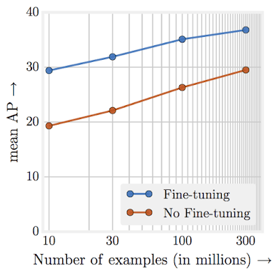
This diagram is from “Revisiting the Unreasonable Effectiveness of Data“, and shows how model accuracy for image classification keeps increasing even as the training dataset size grows into the hundreds of millions. Facebook recently took this even further and used billions of Instagram images labeled with tags to achieve new record accuracy on ImageNet classification. What this shows is that even for problems with large, high-quality datasets, increasing the size of the training set still boosts model results.
This means that you need a strategy for continuous improvement of your dataset for as long as there’s any user benefit to better model accuracy. If you can, find creative ways to harness even weak signals to access larger datasets. Facebook’s use of Instagram tags is a great example of this. Another approach is to increase the intelligence of your labeling pipeline, for example by augmenting the tooling by suggesting labels predicted by the initial version of your model so that labelers can make faster decisions. This has the danger of baking in initial biases, but in practice the benefits often outweigh this risk. Throwing money at the problem by hiring more people to label new training inputs is usually a worthwhile investment too, though it can be difficult in organizations that don’t traditionally have a line item in their budget for this kind of expenditure. If you’re a non-profit, making it easier for your supporters to voluntarily contribute data through some kind of public tool can be a great way to increase your set size without breaking the bank.
Of course the holy grail for any organization is to have a product that generates more labeled data naturally as it’s being used. I wouldn’t get too fixated on this idea though, it doesn’t fit with a lot of real-world use cases where people just want to get an answer as quickly as possible without the complications involved in labeling. It’s a great investment pitch if you’re a startup, since it’s like a perpetual motion machine for model improvements, but there’s almost always some per-unit cost involved in cleaning up or augmenting the data you’ll receive, so the economics often end up looking more like a cheaper version of commercial crowdsourcing than something truly free.
Highway to the Danger Zone
There are almost always model errors that have bigger impacts on your application’s users than the loss function captures. You should think about the worst possible outcomes ahead of time and try to engineer a backstop to the model to avoid them. This might just be a blacklist of categories you never want to predict, because the cost of a false positive is so high, or you might have a simple algorithmic set of rules to ensure that the actions taken don’t exceed some boundary parameters you’ve decided. For example, you might keep a list of swear words that you never want a text generator to output, even if they’re in the training set, because it wouldn’t be appropriate in your product.
It’s not always so obvious ahead of time what the bad outcomes might be though, so it’s essential to learn from your mistakes in the real world. One of the simplest ways to do this, once you have a half-decent product/market fit, is to use bug reports. When people use your application, and they get a result they don’t like from the model, make it easy for them to tell you. If possible get the full input to the model but if it’s sensitive data, just knowing what the bad output was can be helpful to guide your investigation. These categories can be used to choose where you gather more data, and which classes you explore to understand their current label quality. Once you have a new revision of your model, have a set of inputs that previously produced bad results and run a separate evaluation on those, in addition to the normal test set. This rogues gallery works a bit like a regression test, and gives you a way to track how well you’re improving the user experience, since a single model accuracy metric will never fully capture everything that people care about. By looking at a small number of examples that prompted a strong reaction in the past, you’ve got some independent evidence that you’re actually making things better for your users. If you can’t capture the input data to your model in these cases because it’s too sensitive, use dogfooding or internal experimentation to figure out what inputs you do have access to produce these mistakes, and substitute those in your regression set instead.
What’s the Story, Morning Glory?
I hope I’ve managed to convince you to spend more time on your data, and given you some ideas on how to invest to improve it. There isn’t as much attention given to this area as it deserves, and I barely feel like I’m scraping the surface with the advice here, so I’m grateful to everyone who has shared their strategies with me, and I hope that I’ll be hearing from a lot more of you about the approaches you’ve had success with. I think there will be an increasing number of organizations who dedicate teams of engineers exclusively to dataset improvement, rather than leaving it to ML researchers to drive progress, and I’m looking forward to seeing the whole field move forward thanks to that. I’m constantly amazed at how well models work even with deeply flawed training data, so I can’t wait to see what we’ll be able to do as our sets improve!

The article is very interesting but it doesn’t seem that the principles you talk about were applied to your speech dataset. There are a lot of utterances that are wrong, especially the longer words. Only 27 man-hours would be needed to listen to 100000 one-second audio clips, so it seems pretty doable for a large company like Google. So I don’t understand why this wasn’t done even in the second version of the dataset.
A very fair point! In the paper I discuss how I did run a crowd-sourced analysis to weed out bad labels, but there’s definitely still a lot we could improve.
Pingback: https://boingboing.net/2018/05/29/gigo-gigo-gigo.html | Bruce's Blog
You mentioned automl in your post, but it’s still in alpha. Is there an expected date that will be more open?
Happy to help you with your next labeling task / data generation 🙂 through http://www.edgecase.ai . We love working and helping researchers with their data having collected labeled millions of data points! Keep on doing amazing work
Pingback: Data Science newsletter – May 31, 2018 | Sports.BradStenger.com
Nice blog post, very practical advices from a trenches combattant! I’ve shared it with G+ AI Machine & Deep Learning (moderated) and G+ Deep Learning communities
Pingback: Episode 94 - Roaring news - Roaring Elephant
Pete, you post was informative. I can see why you said that it’s best to spend more time on your data. I figure that there’s always more to learn from your data than you think.
Pingback: The Achilles’ heel of neural networks and machine learning – DXC Blogs
Very impressive, I’d like to introduce your post to Korean engineers.
Could I get the permission for translating this post to my blog?
Definitely, and please let me know once you do, I’ll re-share the translation. Thanks!
Reblogged this on softwaremechanic.
Reblogged this on Source Dexter.
Pingback: Il tallone d’Achille delle reti neurali e il machine learning – DXC Blogs
Pingback: d832: Why you need to improve your training data, and how to do it: how much training set quality matters to model performance, and ways to bootstrap a corpus | AI:Mechanic
Pingback: It all Boils Down to the Training Data – Hacker Noon - Coiner Blog
Pingback: 改进模型架构遇到了瓶颈?你该考虑改善自己的数据了! | 小鸡资讯
Pingback: Building a Forecasting Framework for Supply Chain with R
Pingback: Machine Learning still requires Common Sense - Enterra Solutions
Pingback: Preparing your product for machine learning