What I learnt from following walls

Brickwall

When I was 16, I got a copy of The New Hacker’s Dictionary, aka The Jargon File. An entry that stuck in my head was for the AI term Wall Follower. Harvey Wallbanger was an entry in an early AI contest, where the contestants had to solve a maze. The other robots all had sophisticated algorithms with 1000’s of lines of code; all Harvey did was keep moving forward and turning so that his finger was always on the left wall. Of course, he beat them all.

Whenever I fall too deeply in love with the technology I’m building, I try to remember Harvey. Often a little Brute Force and Cunning will produce better results than something more intellectually challenging.

I was thinking of that when I read this paper, on email categorization using statistics. The authors are clearly off-the-charts smart, and they present some promising techniques, but it feels like their goal is unrealistic. Nobody will accept their incoming email being unreliably placed into folders, even if it’s right 90% of the time. I think it’s much more interesting to use the same techniques to present information to the user, by applying a bunch of approximate tags based on the content that aid the user’s email searching and browsing. They’re trying to build something like Yahoo’s web directory; I’d much rather have an imperfect but useful and scalable service like Google’s web search for email.

How to access the Enron data painlessly

Enronicscreenshot

Yesterday I gave an overview of the Enron email corpus, but since then I’ve discovered a lot more resources. A whole academic ecosystem has grown up around it, and it’s led me to some really interesting research projects. Even better, the raw data has been put up online in several easy to use formats.

The best place to start is William Cohen’s page, which has a direct download link for the text of the messages in a tar, as well as a brief history of the data and links to some of the projects using it. Another great resource is a mysql database containing a cleaned-up version of the complete set, which could be very handy for a web-based demo.

Berkeley has done a lot of interesting work using the emails. Enronic is an email graph viewer, similar in concept to Outlook Graph but with a lot of interesting search and timeline view features. Jeffrey Heer’s produced a lot of other interesting visualization work too. He’s produced several toolkits, and some compelling work on collaborating through visualization, like the sense.us demographic viewer and annotator.

Equally interesting was this paper on automatically categorizing emails based on their content, comparing some of the popular techniques with the categorization reflected in the email folders that the recipients had used to organize them. Ron Bekkerman has some other interesting papers too, like this one on building a social network from a user’s mailbox, and then expanding it by locating the member’s home pages on the web.

Which corporation generously donated all their emails to the public domain?

Enronlogo
One of the challenges of trying to build a tool that does something useful with a corporation’s emails is finding a good data set to experiment on. No company is going to give a random developer access to all of their internal emails. That’s where Enron comes to the rescue. The Federal Energy Regulation Commission released over 16,000 emails to the public as part of its investigation into the 2001 energy crisis.

They’re theoretically available online, but through a database interface that seems designed to make it hard to access, and throws up server errors whenever I try to use it. Luckily, they do promise to send you full copies of their .pst databases through the postal system if you pay a fee. If only there were some kind of global electronic network that you could use to transmit files… I will check the license and try to make it available online myself if I can, once I receive the data.

I first became aware of this data through Trampoline Systems’s Enron Explorer, which demonstrates their email analysis using this data set. Since then, I also ran across a paper analyzing the human response times to emails that also builds on this information.

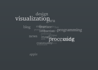
The secret to showing time in tag clouds…

Animatedtags

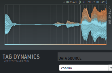
… is animation! I haven’t seen this used in any commercial sites, but Moritz Stefaner has a flash example of an animated cloud from his thesis. You should check out his other work there too, it includes some really innovative ways of displaying tags over time, like this graph showing tag usage:

Taggraph

His thesis title is "Visual tools for the socio-semantic web", and he really delivers 9 completely new ways of displaying the data, most of them time-based. Even better, he has interactive and animated examples online for almost all of them. Somebody needs to hire him to develop them further.

Moritz has his own discussion on the motivations and problems with animated tag clouds. For my purposes, I want to give people a way to spot changes in the importance of email topics over time. Static tag clouds are great for showing the relative importance of a large number of keywords at a glance, and animation is a way of bringing to life the rise and decline of topics in an easy to absorb way. Intuitively, a tag cloud of words in the subjects of emails would show ‘tax’ suddenly blinking larger in the US in April. On a more subtle level, you could track product names in customer support emails, and get an idea of which were taking the most resources over time. Trying to pull that same information from the data arranged as a line graph is a lot harder.

There’s some practical problems with animating tag clouds. Static clouds are traditionally arranged with words abutting each other. This means when one changes size, it affects the position of all the words after it. This gives a very distracting effect. One way to avoid this is to accept some level of overlap between the words as they change size, which makes the result visually a lot more cluttered and hard to read. You can increase the average separation between terms, which cuts down the overlap, but does result in a lot sparser cloud.

I’m interested in trying out some other arrangement approaches. For example, I’m fond of the OS X dock animation model, where large icons do squeeze out their neighbors, but in a very unobtrusive way. I’m also hopeful there’s some non-flash ways to do this just with JavaScript.

How to write a graph visualizer and create beautiful layouts

Mattnetwork

If your application needs a large graph, as I did with my Outlook mail viewer, the first thing you should do is check for an existing library that will work for you. Matt Hurst has a great checklist for how to evaluate packages against your needs. If you can find one off-the-shelf, it’ll save a lot of time.

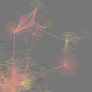
If you need to write your own, the best way to start is absorbing this wikipedia article on force-based layout algorithms. It has pseudo-code describing the basic process you’ll need to run to arrange your graph. It boils down to doing a physics-based simulation of a bunch of particles connected by springs, that repel each other when they get close. If you’ve ever written a simple particle system, you should be able to handle the needed code.

It’s pretty easy to get something that works well for small numbers of nodes, since the calculations needed aren’t very intensive. For larger graphs, the tricky part is handling the repulsion, since in theory every node can be repelled by every other node in the graph. This means the naive algorithm loops over every particle every time when calculating the repulsion for each in the graph, which gives O(N-squared) performance. The key to optimizing this is taking advantage of the fact that most nodes are only close enough to be repelled by a few other nodes, and creating a spatial data structure before each pass so you can quickly tell which nodes to look at in any particular region.

I ended up using a 2D array of buckets, each about the size of a particle’s repulsion fall-off distance. That meant I could just check the immediately neighboring buckets that a particle was in to find others that would affect it. The biggest problem was keeping the repulsion distance small enough that the number of particles to check was low.

In general, tuning the physics-based parameters to get a particular look is extremely hard. The basic parameters you can alter are the stiffness of the springs, the repulsion force, and the system’s friction. Unfortunately, it’s hard to know what visual effect changing one of them will have, they’re only indirectly linked to desirable properties like an even scattering of nodes. I would recommend implementing an interface that allows you to tweak them as the simulation is running, to try and find a good set for your particular data. I attempted to find some that worked well for my public release, but I do wish there was a different algorithm that was based on satisfying some visually-pleasing constraints as well as the physics-based ones. I did end up implementing a variant on the spring equation that repelled when the connection was too short, which seemed to help reduce the required repulsion distance, and is a lot cheaper to calculate.

A fundamental issue I hit is that all of my nodes are heavily interconnected, which makes positioning nodes so that they are equally separated an insoluble problem. They often end up in very tight clumps in the center, since many of them want to be close to many others.

Another problem I hit was numerical explosions in velocities, because the time-step I was integrating over was too large. This is an old problem in physics simulations, with some very robust solutions, but I was able to get decent behavior with a combination of shorter fixed time steps, and a ‘light-speed’ maximum velocity. I also considered dynamically reducing the time-step when large velocities were present, but I didn’t want to slow the simulation.

I wrote my library in C++, but I’ve seen good ones running in Java, and I’d imagine any non-interpreted language could handle the computations. All of the display was done through OpenGL, and I actually used GLUT for the interface, since my needs were fairly basic. For profiling, Intel’s VTune was very helpful in identifying where my cycles were going. I’d also recommend planning on implementing threading in your simulation code from the start, since you’ll almost certainly want to allow user interaction at a higher frequency than the simulation can run with large sets of data.

Hummingbird trail – Slickrock in LA

Hummingbird

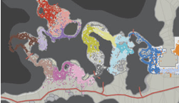
If you’ve ever marveled at the beautiful rocks above the 118 on the pass between Simi Valley and Chatsworth, then you should get a closer look on the Hummingbird trail. Starting just north of the 118 in Simi, you park on the side of Kuehner Road. It’s 2 miles long, and about 1000 feet in elevation gain, so it’s quite a workout. As you can see in the picture, there’s some amazing sections heading across solid rock, it’s a great place to see some naked geology. It’s popular with local mountain bikers, but I also enjoy it as a hike. Bikers have trouble getting up enough speed on this terrain to be a hazard to pedestrians, so there’s not too much user conflict.

Here’s a Google map showing the route:

View Larger Map

Parking is on the east side of Kuehner, 200 yards north of the freeway. There’s an open area between the lot and the start of the trail proper. They’re redeveloping this for housing, but it’s an official trail, so just walk across this section to a small creekbed. The trail itself heads up from here, and is mostly very clearly marked, apart from the slickrock sections. It is quite technical if you’re biking, so take care. There’s also a lot of switchbacks, with sections where people have cut across. These shortcuts turn into streams very easily, since they’re following the ‘fall line’ straight down the hill, so they accelerate erosion and end up scarring the land.

There’s several sections where the trail heads across bare rock. Keep going on the same heading that the trail entered each, and you’ll pick up the next dirt part of the trail. There’s also one section with small painted markers to follow. The whole area burnt several years ago, you’ll still see a lot of charred shrubs amongst the regrowth.

The trail ends at Rocky Peak Fire Road, which you can take back to the Rocky Peak exit of the 118. There’s no real loop you can do on Hummingbird, so I often end up making it an out and back. The climb gives you some gorgeous views out over both Simi and San Fernando Valleys.

Here’s another description of this trail including some of the history, by the Simi Trailblazers.

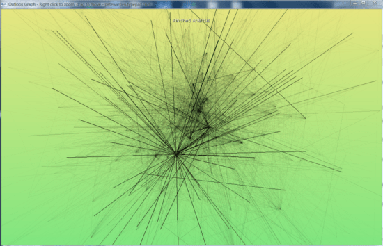
See connections in your email with Outlook Graph

Outlookgraphscreenshot

Outlook Graph is a windows application I’ve been working on to explore the connections that exist in large mail stores. If you’re feeling brave, I’ve just released an alpha version:
Download OutlookGraphInstall_v002.msi.

It will examine all of the Outlook mail messages on the computer, and try to arrange them into a graph with related people close together. The frequency of contacts between two people shown by the darkness of the lines connecting them. My goal is to discover interesting patterns and groupings, as a laboratory for developing new tools based on email data.

The application sends no network traffic, and doesn’t modify any data, but since it’s still in the early stages of testing, I’d recommend using it only on fully backed-up machines. It runs a physics simulation to find a good graph, so on very large numbers of messages it may take a long time to process. I’ve been testing on 10-12,000 message mailboxes on my laptop, so I’ll be interested in hearing how it scales up beyond that.

How to visualize hot topics from conversations

Twittercloud
I’ve found a new example of a good time-based visualization. Twitterverse shows a tag cloud of the last few hours, based on the world’s Twitter conversations. This is one of the things I’ll do with email, and it’s interesting to see how it works here.

There’s a lot of noise in the two-word phrases, with "just realized", "this morning", "this evening" and "this weekend" all showing up as the most common phrases. These don’t give much idea of what’s on people’s minds, but I can imagine you’d need a large stop word system to remove them, and that runs the risk of filtering out interesting phrases too.

A surprising amount of identifiable information came through, especially with single words. For example, xpunkx showed up in the chart, which looked like a user name. Googling it lead me to this twitter account, and then to Andy Lehman’s blog. It may just be a glitch of their implementation, but this would be a deal-breaker for most companies if it had been a secret codename gleaned from email messages. Of course, any visualization of common terms from recent internal emails would make a lot of executives nervous if it was widely accessible. Nobody wants to see "layoff" suddenly appear there and cause panic.

It’s also surprisingly changeable. Refreshing the one hour view every few minutes causes almost completely different sets of words to appear. Either the phrase frequency is very flat, eg the top phrases are only slightly more popular than the ones just below them, and so they’re easily displaced, or their implementation isn’t calculating the tag cloud quite in the way I’d expect.

The team at ideacode have done a really good job with Twitterverse, and there’s an interesting early sketch of their idea here. Max Kiesler, one of the authors, also has a great overview of time-based visualization on the web with some fascinating examples.

What most email analysis is missing…

Alarmclock
… is time. A mail store is one of the few sources of implicit data that has intrinsic time information baked in. The web has a very spotty and unreliable notion of time. In theory you should be able to tell when a page was last modified, but in practice this varies based on sites, and there’s no standard way (other than wayback) to look at the state of sites over an arbitrary period.

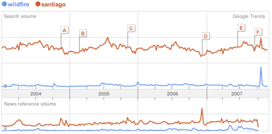
Once you’ve extracted keywords, it’s possible to do something basic like Google Trends. Here’s an example showing frequency of searches for Santiago and Wildfire:
Trendscreenshot
A friend suggested something similar for corporate email; it would be good to get a feel for the mood of the company based on either common keywords, or some measure of positive and negative words in messages. This could be tracked over time, and whilst it would be a pretty crude measure, could be a good indicator of what people are actually up to. Similarly, pulling out the most common terms in search queries going through the company gateway would give an insight into what people are thinking and working on. There’s privacy concerns obviously, but the aggregation of data from a lot of people makes it a lot more anonymous and less invasive. Its harder to turn the beefburger back into a cow, the combined data is a lot less likely to contain identifying or embarassing information.

Similar to Google’s trends, but with more information and better presentation is Trendpedia. Here’s a comparison of Facebook, MySpace and Friendster over time:
Trendpediascreenshot

So far, the examples have all been of fairly standard line graphs. There’s some intriguing possibilities once you start presenting discrete information on a timeline, and allowing interaction and exploration, especially with email. Here’s an example of a presidential debate transcript with that sort of interface, from Jeff Clark:
Transcriptscreenshot

All of these show a vertical, one-dimensional slice of information as it changes over time. It’s also possible to indicate time for two-dimensional data. The simplest way is to accumulate values onto a plane over time, so you can see how much of the time a certain part was active. Here’s an example from Wired, showing how player location over time was plotted for Halo maps to help tweak the design:

Haloscreenshot

What’s even more compelling is showing an animation of 2D data as it changes over time. The downside is that it’s a lot harder to implement, and I don’t know of too many examples. TwitterVision is one, but it’s not too useful. Mostly these sort of animations have to be client-side applications. For email, showing the exchange of messages over time on a graph is something that could give some interesting insights.

Thanks to Matthew Hurst for pointing me to a lot of these examples through his excellent blog.

Can a computer generate a good (enough) summary?

Robot

A description of a document is really useful if you’re dealing with large amounts of information. If I’m searching through emails, or even when they’re coming in, I can usually decide whether a particular message is worth reading based on a short description. Unfortunately, creating a full human-quality description is an AI-complete problem, since it requires an understanding of an email’s meaning.

Automatic tag generation is a promising and practical way of creating a short-hand overview of a text, with a few unusual words pulled out. It’s somewhat natural, because people do seem to classify objects mentally using a handful of subject headings, even if they wouldn’t express a description that way in conversation.

If you asked someone what a particular email was about, she’d probably reply with a few complete sentences; "John was asking about the positronic generator specs. He was concerned they wouldn’t be ready in time, and asked you to give him an estimate." This sort of summary also requires a full AI, but it is possible to at least mimic the general form of this type of description, even if the content won’t be as high-quality.

The most common place you encounter this is on Google’s search results page:
Googlescreenshot
The summary is generated by finding one or two sentences in the page that contain the terms you’re looking for. If there’s multiple occurences, usually the sentences earliest in the text are favored, along with ones that contain the most terms closest together. It’s not a very natural-looking summary, but it does do a good job at picking out the relevant quotations to what you’re looking for, and giving a good idea whether it’s actually talking about what you want to know.

Amazon’s statistically improbable phrases for books are an interesting approach, they try to identify combinations of words that are distinctive to a particular book. These are almost more like tags, and are found by a similar method to statistics-based automatic tagging, by spotting combinations that are frequent in a particular book, and not as common in a background of related items. They don’t act as a very good description in practice, they’re more useful as a tool for discovering distinctive content. I also discovered they’ve introduced capitalized phrases, which serve a similar purpose. That’s an intriguing hack on the English language to discover proper nouns, I may need to copy that approach.

The final, and most natural, type of summary is created by picking out key sentences from the text, and possibly shortening them. Microsoft Word’s implementation is the most widely used, and it isn’t very good. There’s also an online summarizer you can experiment with that suffers a lot of the same problems.

There are two big barriers to getting good summaries with this method. First, it’s hard to identify which bits of the document are actually important. Most methods use location, if it’s a heading or the start of a paragraph, and statistical frequency of unusual words, but these aren’t very good predictors. Even once you’ve picked the ones you want to use, here’s also very little guarantee that the sentences will make any sense when strung together outside the context of the full document. You often end up with a very confusing narrative. Even MS in their description of their auto summary tool acknowledge that at best it produces a starting point that you’ll need to edit.

Overall, for my purposes displaying something like Google or Amazon’s summaries for an email might be useful, though I’ll have to see if it’s any better than just showing the first sentence or two of a message. It doesn’t look like the other approaches to producing a more natural summary are good enough to be worth using.