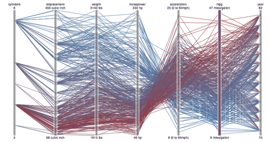
I love visualizations, but they keep letting me down. I think I've built something that tells a crystal clear story, only to see people's eyes glaze over when they sit down in front of it. Why don't most of my pictures communicate the story I want to tell? And how was my map of Facebook connections different, what did I learn from its success?
The obvious place to look is Edward Tufte's work, but even as a fan I still find myself producing unintelligible visual explanations. Instead, I've found it more useful to think about the problem in a much simpler way. I use a visual vocabulary that nobody else understands. Without really noticing, I've invented a private language that makes perfect sense to me but conveys nothing to anyone else. So how do I make myself understood?
Keep it simple
There really is a visual vocabulary that we all learn. Our visual vocabulary is not as obvious as the verbal one because acquiring it is a much more informal process. There's no dictionaries or classes dedicated to understanding diagrams, so I had the unconscious idea that they just automatically make sense. This is seductive because our culture ensures that most of us do readily comprehend common charts like maps and bar graphs, which in fact would be incomprehensible to most of our ancestors. As the Tour through the Visualization Zoo points out "Although a map may seem a natural way to visualize geographical data, it has a long and rich history of design". Every familiar form (even the map) had to be invented, and only became widely-understood after it had proved its usefulness over a long period of time.
I try to remember that and stay humble whenever I'm tempted by a shiny new way of presenting data. There's probably about six basic ways of presenting data that everyone understands, colored maps (choropleth, hate the name!), points on maps, bar graphs, line graphs, pie charts and scatter graphs. If the new technique doesn't reuse people's understanding of those basic elements, 99% of people will look blank and move on. A few highly motivated people might puzzle out what you're showing, but if you want to tell a story to a wide audience, keep it painfully simple.
Label and annotate
I'd released an earlier version of my Facebook connections map two weeks before the version that became popular. It shows exactly the same connections, but without any coloring, labels or descriptions. The crucial breakthrough in reaching a mass audience was adding that extra guidance, making it very clear what I thought the diagram showed. I could see the same story in the spider web of connections, but that was because it was in a visual language I understood. By highlighting and naming the different areas I was able to tell that story to other people who would otherwise be baffled by the mass of lines.
Animate and interact
There's a massive untapped element that everyone understands: time. Before computers came along, animated graphs were almost unheard of, so they are absent from the traditional literature on creating good diagrams. The tools are still lagging behind the possibilities, but there's a rich world of vocabulary and metaphors to draw on. Our brains come packed with hardware to translate moving images into meaning and Saturday morning cartoons help train that capacity! If you can take common elements like bar graphs and animate them, you've got a whole new axis to display information on.
Even better, you can pack more information in without confusing people by making your charts interactive. If someone selects an element, you can focus on that dimension of your data in much more detail, something that's impossible when you're communicating through a sheet of pulped wood.
Show me
You may have noticed that my last point doesn't fit, I didn't use time or animation in my Facebook visualization. That was because I didn't have the technology I needed, so I have no proof to demonstrate that I'm right. I'm working to remedy that problem, so stay tuned for my next project.
