I just added a new feature to my directory of Boulder tech Twitter users; a map of the social network.
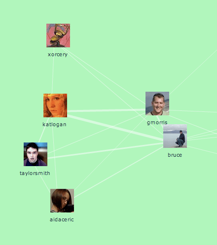
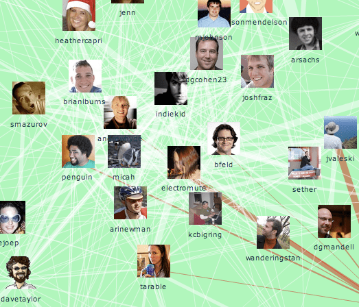
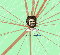
It shows who talks to who. A line between two people means that they've sent public replies to each other. The thicker the line, the more often they've exchanged tweets.
To turn this into a map, I use an automatic technique called force-directed layout to pull people with strong connections to each other closer. That means that groups of people who talk amongst themselves a lot will form clusters. So what does this map show?
There's a central cluster of people who have a lot of connections with other people in Boulder. Many of these people I've met, and they do all seem influential in the community. If you wanted to get the ball rolling on a local project, these would be the folks to talk to.

In my next post, I'll show how I uncovered some new people I'll be adding to the Boulder Twits list, thanks to graph analysis. If you're interested in learning more about the fun you can have with these sort of networks, check out Valdis Krebs' awesome gallery of case studies.

