I'm flying out to the East Coast next weekend and have some gaps in my schedule. I'm attending a planning meeting for the upcoming Strata O'Reilly conference, and I would love to get thoughts on sessions from other data geeks. So if you're free in downtown Boston at 2pm on Friday September 24th, or in Manhattan at 3pm on Monday September 27th, and you're interested in Big Data and visualizations, drop an email to pete@mailana.com and I'll send you the meetup details.
Author Archives: Pete Warden
Five short links
Mapumental – A really useful visualization that promises to help you find the ideal place to live, letting you interact and question the data in an intuitive way. This is exactly why I built OpenHeatMap, an interactive data map opens up so many possibilities. Now I’m eagerly awaiting the live product.
Guide to finding a technical co-founder – Vinicius’s guide rings very true to me, and most of his points also apply to finding a business co-founder if you’re technical. The short story is, it’s hard. Really hard. I spent a lot of time and effort on the hunt, and still failed. It will help a lot if you’re flexible about what you want to work on, then you might get lucky at co-founder dating events or via other random connections. My biggest regret is that I didn’t set myself a deadline, I kept at it long after I should have given up on the search and either dropped my idea or focused on getting traction instead (which is what I eventually ended up doing).
7,000 Neighborhood shapefiles – I only just came across this resource from Zillow, it’s incredibly handy who wants to talk a geographic language that users understand. We all talk about neighborhoods in our daily life, but this is the only open resource I’ve found that gives you definitions you can use.
Who is the greatest diva of the last 25 years? – I love this mostly because of the brutally honest description of their methodology (“We used computers!”). Truth be told, most of the visualizations you’ll see on the web don’t have much more behind them either, including some of mine on a bad day. Always try to look beyond the veneer of authority that charts and infographics give to any argument.
Twitter contour maps – Talking of substance before style, here’s a spartan visualization with some great data and ideas behind it. I’m looking forward to the next version of Twitterplaces from Ben, he’s digging deep in some interesting territory.
OpenHeatMap now visualizes Canada and Mexico

http://www.openheatmap.com/view.html?map=PentaptychWardererIdioticalness
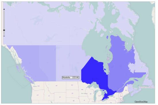
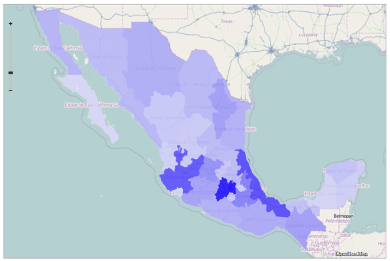
After the UK, the most-requested countries for OpenHeatMap have been Canada and Mexico, so I'm pleased to launch state/province level coverage for both of them. All you need to do is create either a Canadian province or Mexican state column in your spreadsheet and I'll take care of the rest!
Unfortunately I haven't been able to find more detailed information for either country, I'd love to find electoral boundaries for both, but I'll keep looking. I also have leads on Turkey, Australia, New Zealand, Germany, Austria, Switzerland and Ireland, so I hope I can cover even more of the world.
If you don't want a thematic map, and are happy with blobby heatmaps instead of filled polygons, you can already use OpenHeatMap with international street addresses, just put them in an address column.

http://www.openheatmap.com/view.html?map=TheodramaProctologicApogeny
OpenHeatMap now visualizes the UK
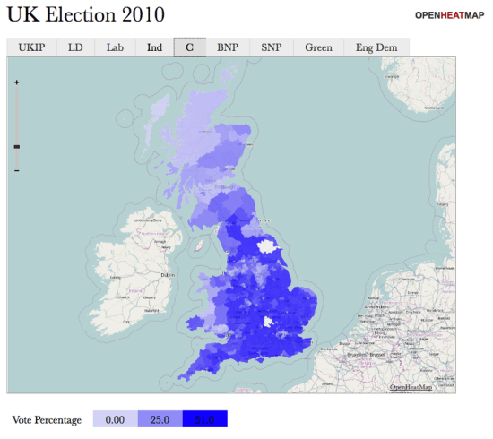
I've had a lot of requests from friends in the old country wanting to use OpenHeatMap to display data about areas in the United Kingdom. After quite some time wrestling with the Ordnance Survey's recent release of open data I'm pleased to announce that you can now visualize everything from counties to constituencies to council districts! To celebrate, I've created a visualization of the recent election, showing the percentage of the vote that each party received in every constituency:
To go along with it, I've put together a quick 'making of' video tutorial, showing how it only takes a couple of minutes to transform the Guardian's spreadsheet of election data into an interactive map:
I just want to say a big thanks to everyone who helped me gather this data, especially Matthew Somerville of MySociety who went above and beyond to help me understand counties, Simon Rogers for making the election data freely available, along with Cameron Neylon, Colin McCrory, Chris McCray, Leigh Dodds, Bill Roberts, John Goodwin, Richard Stirling and Laura Oliver.
Do you wish you could visualize data about regions of your country? Drop me an email and I'll see what I can do (and maybe rope you in to investigate if your government makes the data openly available!)
Build a map, win an iPad!
Did I mention how much I like the folks over at This Week in Relevance? They've just launched a competition where the best OpenHeatMap wins an iPad! I love that idea so much, I'm going to give a free t-shirt to everyone who enters too.
If you're looking for inspiration, just today I've helped people build maps of UEFA cup rankings, amphibian habitats, oil well starts, college alumni, and even someone's friends on Facebook, and that was without the lure of a lovely Apple gadget at the end.
As always, I'll be online as much as I can and available to chat via the awesome SnapABug (I had four simultaneous conversations going at one point this afternoon), or you can email me via pete@mailana.com or IM me at petewarden on Skype.
Where are LA’s most effective schools?
After seeing the LA Times analysis of how effective local teachers are at improving their students performance, I was left wondering how the different neighborhoods performed. School rankings based on pure academic achievement aren't that informative since they correlate very closely with the wealth or poverty of their students family, but the 'value-added' approach seemed like it might produce more informative patterns. Here's the map I built, using the Times' ranking of schools from one to five, where dark blue marks the most effective elementary schools:
http://www.openheatmap.com/view.html?map=EricolinCounterweightsPuffinus
As always, here's the code I used to gather and format the data to load into OpenHeatMap:
http://github.com/petewarden/schoolcrawl
There's an obvious cluster of under-achieving schools between Culver City and downtown LA, but I was pleased to see some pretty poor areas like Compton showing some effective schools. Northridge seems to have a lot of great schools too, along with Culver City and Santa Monica, though there are a few surprises with 'one' rated schools tucked in amongst the rest.
Remember you’re a Womble
I'm excited to be doing a presentation at Defrag again this year, Eric Norlin gathers together an amazing bunch of people. As I was exchanging emails with him about the conference I found the theme to The Wombles kids show from the 70's going through my head. I've always struggled to find the right label for what I do, Implicit Data was the original inspiration for Defrag, these days Big Data is en vogue, but none of them are very descriptive. I realized that Recycled Data might be a better theme, which makes me a Womble:
Underground, overground, Wombling free
The Wombles of Wimbledon Common are we
Making good use of the things that we find
Things that the everyday folk leave behind
What's really changed in the last few years is that the technology for grabbing large amounts of data and analyzing it is now incredibly cheap. Just as mining companies are using new technology to extract metal from decades-old piles of waste material, so researchers are starting to pull useful information from data that the big players see as valueless.
I think the root cause of my troubles with Facebook was that they didn't realize what a rich source of information the public profiles they exposed to search engines were. Individually they only displayed a name, a handful of friends and some pages each user liked, which seemed worthless. What they didn't understand was that if you have enough of them, important and interesting patterns start to emerge. Even junk data becomes valuable at scale. Who'd have thought that analyzing which pages link to each other could become a gushing fountain of money for Google, once they had enough pages crawled?
I feel like a kid in a candy store, there's so many great sources of public data to choose from I hardly know what to visualize first, and I'm surprised there aren't more people taking advantage of this bounty. From Crunchbase, to Google Profiles, Twitter, US Census data, make good use of the things you can find, things that the everyday folks leave behind, and remember you're a Womble:
The March of Twitter – Technical notes
This is a quick run-down of the technical side of my guest post chronicling the March of Twitter on Hubspot's blog. Do go check out that article, I was able to have a lot of fun using Dharmesh's data.
Putting together that analysis of the early days of Twitter involved a lot of detective work and 'filling in gaps', since I don't have access their internal traffic data, so I want to cover exactly what I did to produce it.
The map of the spread of Twitter over several years was based on a dump of 4.5 million accounts from the Twitter Grader project. Dharmesh had already done some normalization on the location fields, so I first filtered to remove everybody with a non-US address. That left me with 1.5 million profiles to work with. I believe that Grader's collection methods make those a fairly random sampling of those from the full universe, so I could use the frequency of users in different locations over time to build a visualization that accurately showed the relative geographic presence, even if I can't give accurate absolute numbers. This incomplete sampling does mean that I may be missing the actual earliest user for some locations though.
I accomplished this using ad-hoc Python code to process large CSV files. I've published these as random snippets at http://github.com/petewarden/openheatmap/blob/master/mapfileprocess/scratchpad.py
The second analysis looked at the adoption levels over the first few months. This was a lot trickier, since those sort of absolute figures weren't obviously available. Happily I discovered that Twitter gave out id numbers in a sequential way in the early days, so that @biz is id number 13, @noah is 14, etc. I needed to ensure this was actually true for the whole time period I was studying, since I was planning on searching through all the possible first few thousand ids, and if some users had arbitrary large numbers instead I would miss them. To verify this relationship held, I looked at a selection of the earliest users in the Grader data set and verified that all of them had low id numbers, and that the id numbers were assigned in the order they joined. This confirmed that I could rely on this approach, at least until December 2006. There were frequent gaps where ids were either non-assigned or pointed to closed accounts, but this didn't invalidate my sampling strategy. Another potential issue, that also affects the Twitter Grader data set, is that I'm sampling user's current locations, not the locations they had when they joined, but my hope is that most people won't have changed cities in the last four years, so the overall patterns won't be too distorted. There's also a decent number of people with no location set, but I'm hoping that also doesn't impose a systematic bias.
For the first few thousand users I went through every possible id number and pulled the user information for that account into a local file, which I then parsed into a CSV file for further processing. Once the number of new users grew larger in August I switched to sampling only every tenth id and making each found account represent ten users joining in the data. Once hiccup was a change in late November where Twitter appear to switch to incrementing ids by ten instead of one, so only ids ending in the last digit 3 are valid, which I compensated for with a new script. Shortly after that in December I again detected a change in the assignment algorithm that was causing a slew of 'no such account' messages during my lookup, so I decided to stop my gathering at that point.
The code for all this processing is also included in http://github.com/petewarden/openheatmap/blob/master/mapfileprocess/scratchpad.py, though it's all ad-hoc. The data for the first few thousand users is available as a Google Spreadsheet:
https://spreadsheets.google.com/ccc?key=0ArtFa8eBGIw-dHZjOUl3eXRzX19PLUFVQUNTU3FndFE&hl=en
You can also download the derived daily and monthly figures here:
https://spreadsheets.google.com/ccc?key=0ArtFa8eBGIw-dG5FU0hJZHI3RkVVMUgtaDhyczZxM1E&hl=en
https://spreadsheets.google.com/ccc?key=0ArtFa8eBGIw-dFlpS0QxSUw5blEtVjdyd2FaT2FySmc&hl=en
I attacked this problem because I really wanted to learn from Twitter's experiences, and it didn't seem likely that the company themselves would collect and release this sort of information. Of course I'd be overjoyed to see corrections to this provisional history of the service based on internal data, if any friendly Twitter folks would care to contribute? Any other corrections or improvements to my methodology are also welcome from my readers.
Five short links

Photo by EmilyDickinsonRidesABMX
If it quacks like an RDBMS – This article made me feel old, but in a good way. It lists all the design constraints that Mongo has been able to avoid by focusing on modern machines. Does this mean I can finally stop targeting 32 bit address space systems?
Why should engineers and scientists be worried about color? – I’m always slightly bemused that I’ve spent my entire career in the graphics world despite being color blind, but maybe it’s made me more attentive to the sort of issues raised in this article. It’s a good illustration that infographics can be just as misleading as a written description, despite their air of objectivity, and so you need to be as careful in your visual choices as you are in the words you pick. Via Daniel Stadulis
Data Mining the Heart – Good coverage of the recent wave of academic studies that use social sites as natural experiments. This is only the beginning for this sort of research, we’re all instrumenting our lives in a thousand ways each day, every time we interact with an online service.
Challenges in front of us – I feel a strong affinity for Alex and Tim as they flesh out their service. They’re unfunded, despite having paying customers, but they’re fighting like demons to build the business. I know from my own experiences that the hardest battle there is psychological, keeping yourself motivated when you seem to be shouting into an empty void.
Needle in the Haystack – The story of a bio-entrepreneurs epic battle to save his daughter’s life by analyzing a mountain of genetic data. His persistence is inspiring, and I can’t think of a more important application of the newly-cheap tools for processing big data.
The top 10 zip codes for startups
Brad asked an interesting question on his blog today – Boulder seems packed with entrepreneurs, but what's the real density of those sort of folk to the general population? His guess is almost everyone in Boulder is either working at an entrepreneurial company or going to college.
The data to answer that is floating around on the web, so I thought it would be a great demo of the value of grabbing data in bulk (as opposed to siphoning data through a preset API), and of visualizing the results. Crunchbase has a liberal robots.txt and data license, so I wrote up a crawler that pulled down the information on all 45,000 companies in their database. The US census releases population data for zip codes, so then it was just a simple matter of programming to derive some per-person stats for different areas. I didn't trust the employee counts in Crunchbase (they're not the first thing someone would update) so instead I chose a couple of related indicators – the total number of companies in a location, and how much venture money they'd raised between them. Here's the top 10 zip codes for each category:
 Amount raised per-person
CA 94104 – $629m total – $1,681,925 per person
CA 94304 – $2,822m total – $1,656,031 per person
CA 94105 – $972m total – $472,540 per person
MA 02142 – $1,013m total – $448,833 per person
IL 60606 – $739m total – $439,744 per person
CA 92121 – $1,826m total – $429,847 per person
CA 95113 – $202m total – $373,077 per person
MA 02210 – $135m total – $229,442 per person
WA 98033 – $5,662m total – $186,292 per person
NY 10004 – $168m total – $137,404 per person
Companies per-person
CA 94104 – 87 companies – 0.233 per person
CA 94105 – 173 companies – 0.084 per person
CA 95113 – 24 companies – 0.044 per person
MA 02142 – 73 companies – 0.032 per person
MA 02210 – 19 companies – 0.032 per person
CA 94111 – 103 companies – 0.031 per person
CA 92121 – 116 companies – 0.027 per person
NY 10004 – 29 companies – 0.024 per person
IL 60606 – 39 companies – 0.023 per person
NY 10005 – 20 companies – 0.023 per person
This is a crude approach to take, since the Crunchbase data may not be a representative sample, etc, but it gives a good first approximation. I've open-sourced all the code and data, so if you have ideas on improving this, jump in.
Next of course I wanted to visualize this data. Thanks to the sheer mindblowing awesomeness(*) of my OpenHeatMap project, all I had to do was upload my spreadsheets to get these maps of the data:
And here's a couple of detailed views of the funds raised in Colorado and the Bay Area:
* Mileage may vary. Standard terms and conditions apply


