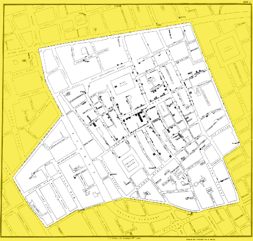
Thanks largely to Tufte's evangelization, John Snow's map of the 1854 cholera outbreak in Soho has become the classic example of the power of visualizations. I've just finished Steven Johnson's The Ghost Map that tells the story behind the graphic, and it's surprisingly different from the simplified explanation that usually accompanies the picture.
The map wasn't that innovative
Snow wasn't the first person to draw these kinds of maps, he wasn't the first to draw them to track disease, and in fact he wasn't even the first person to map this particular outbreak! The Sewer Commision produced a very detailed map showing the death locations. The power of Snow's version came from his decision to leave out a lot of details (sewer locations, old grave sites, etc) that cluttered up the Commision's version. Their map was so muddled that it didn't tell a story, but Snow's was stripped-down to show exactly what he needed to bolster his theory that the epidemic spread from the water pump.
The only technical innovation that Johnson identifies was his use of boundary lines to mark the areas that were closest to particular pumps by walking distance, to demonstrate that many of the cases nearer to other water sources as the crow flies were actually in the catchment area of the Broad Street pump. Unfortunately that version of the map is rarely shown, and Tufte himself dismisses it as "Voronoi baloney"!
Theory came first
From the popular account it's easy to imagine that Snow plotted the deaths on his map, then the pump locations, and that triggered a revelation. In fact he'd been fighting for a decade to prove that cholera was a waterborne disease, not spread atmospherically as the miasma theory claimed. He'd already gathered a lot of evidence from the differing rates of the disease amongst neighbors using piped water from different suppliers. It was a tool for "hypothesis testing" not "hypothesis generating".
Data gathering was the key
Together with the Henry Whitehead and local doctors, Snow spent weeks going door-to-door gathering detailed information from area residents. He was then able to present that data as evidence for his theory in a variety of forms, including anecdotal case histories, numerical analyses and his maps. The key was that this hands-on experience with the raw data gave him the story he wanted to tell, and then he was able to make his argument using a variety of different presentation tools.
These two ideas are essential points for my work; a lot of the recent approaches to visualization assumes that you can give ordinary people simple map or graph creation tools, and they'll be inspired to create powerful graphics. With OpenHeatMap I've concentrated on people who already have a story to tell; journalists, activists and other people who are highly motivated to make an argument. It's about empowering people who are looking for a solution, not hoping that we'll turn passive observers into active participants just by handing them the tools.
The map became marketing
The actual story and evidence behind Snow's work is complex and hard to explain. As his theory became widely accepted as a massive historical advance, the map came to stand as shorthand for the story behind it. After that, it was easy to imagine that the graphic was the central evidence of his report on the outbreak. In fact it was just one piece of evidence, but it was so accessible and easy to use as an illustration that it spread slowly but virally through different publications. As Johnson puts it in his book "the map was a triumph of marketing as much as empirical science".
This is something I've seen in my own work too. Visualizations are fantastic at engaging people, everyone loves maps. When it comes down to detailed analysis though, a spreadsheet or other list-based interface is almost always better. Maps and other visualizations tell stories so well because of how much they leave out, but textual representations still rule when it comes to actually working with the full data. Think of your visualizations as powerful marketing tools, as bait to get people in the door, but expect to offer them something deeper when they want to work with that data.
There's a lot more to the story than I can cover here, so if you've got any involvement in data analysis or visualization you should pick up The Ghost Map, it's full of so many lessons and is a gripping read on top. I also recommend this short academic paper "Essential, Illustrative, or . . . Just Propaganda?" that argues for a different perspective on Snow's work than both the traditional popular account, and Johnson's revised approach.
