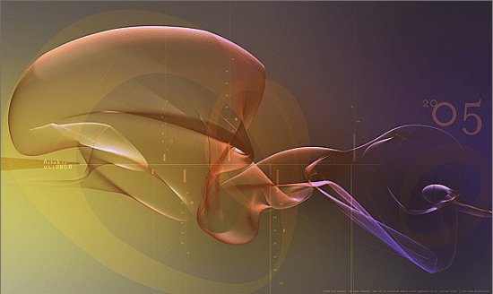
It’s hard to imagine a more codified visualization than a calendar. You have a grid of cells, with each row representing a week, and that’s pretty much it. That’s what my good friend Kent Oberheu set out to change. Over the past 5 years he’s produced 60 monthly calendars that show time contorting in strange paths, all embedded in his art. The regularity of a traditional calendar is lost, instead you really see the flow of time. It helps me remember that every day is unique, just like his visualizations.
I don’t think these are going to replace standard calendars, but it’s a demonstration that looking at even the most mundane information in unusual ways can start you thinking in new directions. Kent’s better known as Semafore in the design world, and after years as a designer with Apple he’s just moved to a new position at Industrial Light and Magic. All the time I’ve known him he’s been pushing into new visual territory, finding magic combinations that tickle your aesthetic nerve and manage to get something across at the same time. He’s the first person I turn to when I need to talk about designing visualizations, and the combination of my engineering skills and his design direction has worked very well.
As I’ve gone deeper into the subterranean world of information that’s held on companies’ Exchange servers, it’s obvious that part of the toolkit for navigating has to be new ways of looking at that data. Some of that can be borrowed from the recent explosion of web visualizations, such as animated tag clouds for your email content, but some of the challenges are unique. How can you do a decent view of different versions of your attachments over time for example?
That’s where the Information Aesthetics blog comes in. It was the first place Kent sent me when I started to ask him for inspiration, and it’s full of the latest and most beautiful visualizations. Some of my recent finds from there include wordle, a Java applet that lets you create very good-looking word clouds, the Information Design Patterns Cookbook and the Mount Fear physical sculptures representing London crime statistics. I don’t know if I’m going to cut up cardboard to build an art piece from the Enron emails, but all of this starts trains of thought on how to adapt these innovations to my problem space. If you’re looking for inspiration too, I’d highly recommend subscribing.
