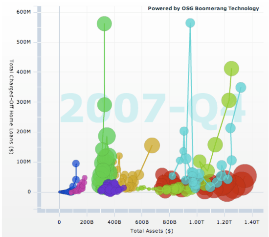
The web gives us an amazing opportunity to use animation in visualizations. Showing change over time graphically, and allowing users to absorb and interact by pausing and scrubbing in the timeline, lets you comprehend a lot more information than a static image can give. You can show an animation on TV, but that doesn’t give the viewers a chance to pause, rewind and really understand what’s happening. Of course, just as designing a good 2D picture to show information is a lot tougher than outputting a textual list, working out how to get across information in animation takes a lot of skill. That’s why I’m so impressed by these visualizations of bank’s mortgage liabilities.
The two charts show how many of the main banks’ mortgages are in trouble, either over 90 days delinquent on payments (the usual cutoff for the start of the foreclosure process) or the charged-off (aka written-down) value on all their mortgages. What’s fascinating is seeing sudden explosion in both measures of trouble in the last few quarters as you play back the animation. It makes the magnitude of the shock very clear, and explains why so many financial folks have been freaking out, far better than seeing the same figures in a static graph. Overall it does a good job of communicating some complex information in a very compact form.
The graphs themselves are written in Flex, and are examples of the Boomerang data visualization technology that the OSG group has developed for internal business intelligence applications. On the main site they have some slightly more complex and flexible versions of the same charts. They’re doing very interesting work with their projects like Savant and Hardtack to break down the barriers between the data silos that exist within most businesses. They seem to be approaching the problems with very modern techniques, using RSS and other tools that allow easy mashing-up of data from legacy systems. I’ll be interested to hear if they’ve looked at using email as a source too.
If you’re interested in more of the financial-nerd details of the mortgage meltdown, my favorite source is the Calculated Risk blog. Their analysis of the primary data on housing is invaluable.
