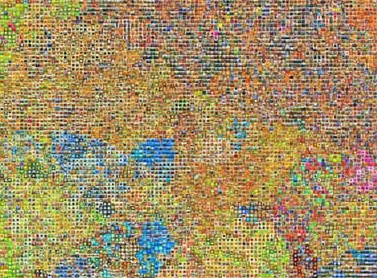
In case you missed it on ReadWriteWeb, researchers at MIT and NYU have created a fascinating visual map of nouns. They’re pulling the word relationships from WordNet, a venerable data set that maps the relationships between over 150,000 words. I’ll be studying their paper to understand exactly how they grouped the nouns, since they seem to have done a great job of clustering them in a meaningful way across a 2D surface. That could be very useful for keyword similarity measurements and email grouping.
It also reminds me of a film-strip visualization that I saw a couple of years back, but which I can’t find the reference for unfortunately. A frame was taken every 5 seconds from a movie, and shrunk to a few pixels, and then the sequence of images were arranged in a grid. You could get information about the different scenes and moods in the whole movie at once, just from the color of each section. It wasn’t much but it was enough to let your brain’s visual processing machinery comprehend the structure.
In the same way, this map is a good way of presenting the whole space of noun categories in a way that’s much easier to navigate than a hierarchical tree or table. A common trick for memorizing arbitrary data like long random numbers is to associate each part with physical locations, because we evolved to be really good at remembering exactly where all the fruit (and leopards!) were in the local jungle. It’s easy to find and return to a given noun in this setup because you’re using the same skills.