Five short links

fivestatues

Photo by Joe Baz

Tech’s untapped talent pool – I’m a massive fanboy of sociologists, they can reliably answer questions about human behavior in ways that are light-years ahead of most data analysis you see online. Data science’s big advantage is that we have massive new sources of information, and more data beats better algorithms, but I’m excited to see what happens when sociology’s algorithms meet the online world’s data!

ZIP codes are not areas – This one confused the hell out of me when I started getting serious about geo data, but the only true representation of ZIPs is as point clouds, where every building with an address is a point. The spatial patterns make drawing a boundary even for a single moment in time hard enough, but as houses are built and demolished, the layout changes in unexpected ways.

It’s hard not to leak timing information – A cautionary tale of how tough it can be to be sure even a simple function like a string comparison doesn’t give away useful information to a malicious user.

PLOS mandates data availability. Is this a good thing? – We all love open data and reproducible science, but there are hard practical problems around the mechanics of making big data sets available, ensuring they’ll be downloadable over the long term, and avoiding deanonymization attacks.

Better performance at lower occupancy – Processors are incredibly complicated beasts, and our simple mental models break down when we’re trying to squeeze the last drops of performance out of them. This is a great example of how even the manufacturers don’t understand how to best use their devices, as a Berkeley researcher demonstrates how to get far better performance from an Nvidia GPU than the documented best practices allow.

A walk around Andy Goldsworthy’s Presidio sculptures

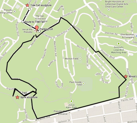
A friend recently introduced me to Andy Goldsworthy’s work, through the Rivers and Tides documentary, so I was excited to see some of his ‘land art’ up close in San Francisco’s Presidio Park. The official site has some great background, but I couldn’t find a good guide to exploring all three of his scattered pieces, so here’s a quick rundown and map showing how I ended up navigating around. The hike itself is roughly two miles long, with well-maintained trails, and a few hundred feet of climbing but nothing too terrible.

goldsworthymap

Parking can be tough in the Presidio, but thankfully it was a rainy Super Bowl Sunday, so I found a spot in a small two-hour free parking section behind the Inn at the Presidio. I was actually originally aiming for the Inspiration Point parking lot, but that turned out to be closed for construction, so I was thankful to find something close to where I needed to be. There is plenty of paid parking nearer the Disney museum too, just a couple of blocks away, if you do get stuck.

There’s a trailhead and map at the parking lot, and from there I headed up the Ecology Trail, a reasonably steep fire road towards Inspiration Point. Once I reached the under-construction lot there, the view was beautiful, even on a wet day, looking out over Alcatraz and the bay. If you look away from the water, you should be able to see the top of Andy’s ‘Spire’ sculpture. As of February 2014, the construction made the normal trail to it inaccessible, so I ended up hiking a couple of hundred yards right along Arguello Boulevard, and then taking a use trail up to the main trail. It’s easy to navigate with the peak of the sculpture to guide you at least.

The piece itself is a tall narrow cone of unfinished tree trunks, all anchored deep in the ground and leaning in on each other. My first visit was at twilight, which gave it a very stark and striking silhouette, and it pays to find a spot where you can see it against the horizon, it’s hard to take it all in up close.

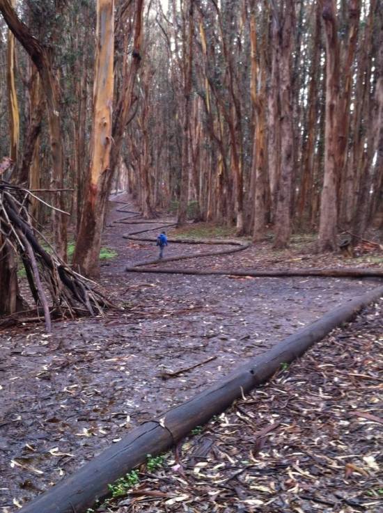
I then headed back to the Inspiration Point parking lot, and went back down to rejoin the Ecology trail, and continued along it almost to the edge of the park. I then followed the trail that parallels West Pacific Avenue all the way to the Lovers Lane bridleway. Just on the other side of Lovers Lane is the second Goldsworthy work, ‘Wood Line’. It’s a series of tree trunks with their barks stripped, arranged in a continuous snaking line for a thousand feet or so, starting and ending by disappearing into the earth. The look alone is very striking, but I also couldn’t resist the urge to walk along the whole length. I’d normally be horrified at the thought of clambering on public sculpture, but it didn’t feel like a bad way to interact with the work, it’s so open to the elements, and it forced me to look closely at it just to avoid slipping off!

woodline


Photo by Joanne Ladolcetta

Afterwards, I continued down Lovers Lane to its end at Presidio Boulevard, and then headed left along Barnard Avenue. There are a set of steps on the right that lead back to the parking lot, so I stopped by the car and dropped off my pack. The final piece is inside the old Powder Magazine, a couple of blocks away at the corner of Anza and Sheridan. I headed there by turning left along Moraga, and then right down Graham. The building itself is easy to spot, standing alone in the middle of the green near the Disney Museum, and right now is open 10am to 4pm on the weekend, and at other times by appointment.

‘Tree Fall’ is a giant eucalyptus fork, jammed into the roof of the 20 foot square building, with the tree and curved ceiling all covered in local clay that’s been allowed to crack naturally as it dries. The effect is like being inside a giant body, staring at arteries, especially as the only light is what comes in through the door way. The docent was able to give us some background too, apparently the piece is expected to stay for the next three or four years, and the binding they used for the clay was hair from a salon around the corner from my house. There’s apparently a new documentary coming too, and shows Andy’s children, who were young kids in the 2000 film, coming out to San Francisco to help assemble this piece.

Looking at all three works in the same day left me looking at the landscape of the Presidio a little differently, so I hope you get a chance to explore what he’s trying to do too.

Five short links

doorfive

Photo by Giampaolo Macorig

Clocks are bad, or welcome to distributed systems – “If your distributed system isn’t explicitly dealing with data conflicts, any correct behavior it exhibits is more a matter of good luck than of good design.” Ten years ago, I was shooting myself in the foot with threads, now it’s distributed algorithms! I think we’re going to look back on the single-core CPU days as a golden age of simplicity.

The colors of sunset and twilight – I’m attempting to measure global pollution levels by analyzing the colors of millions of Instagram photos of sunsets around the world. The data isn’t cooperating yet, but it’s led me into a fascinating world of atmospheric science. Apparently there’s a lot more of a complex relationship between sunset brilliance and pollution than folk wisdom had me believing.

How misaligning data can increase performance 12x by reducing cache misses – Understanding how processor caches work is a secret weapon for serious optimization work. Once you’ve got rid of the obvious algorithm bottlenecks, keeping your working set of data in cache can make an order-of-magnitude difference if you’re chewing through big arrays.

Yale censored a student’s course selection website. So I made an unblockable replacement – The only truly open space for transforming and combining data these days is client-side. It’s a shame browser extensions are such a niche distribution channel, they give small players the freedom to get creative on top of large existing data sets. I really hope a killer app for client-side remixes appears, that would open the door for a lot more innovation.

My dad will never stop smoking pot – I spent my early twenties as a heavy pot smoker, and I was an unhappy mess who let people around me down constantly. I’m glad to see legalization gathering momentum, I know plenty of people who can smoke without those problems, but this story was a painful reminder of those days for me.

Five short links

fiveinches

Photo by Sean Lamb

Nine ways to break your system code using volatile – Even seemingly-simple constructs in low-level languages can have tremendous subtleties. I love reading explorations like these, hoping I never need to use the knowledge in production, but feeling like a little more of my in-game map has been filled in. At some point pedantic becomes sublime.

Bayes Rule and the paradox of pre-registration of RCTs – There’s a movement to declare what hypotheses you’re going to test before you start your research, to avoid the classic cherry-picking problem. Donald does a great job explaining why it should make a big difference in how much we trust study results, even though it feels counter-intuitive, and again a bit pedantic. I guess 2014 is becoming the year I try to bring pedantry back?

Are towns stuck in the wrong places? – It’s not often you can perform a 2,000 year-long natural experiment, but this look at the performance of British and French towns after the Romans is intriguing, and very relevant as we consider how to respond to struggling cities like Detroit.

The Chinese wheelbarrow – The eastern version of the wheelbarrow could carry far larger loads than the European approach, thanks to the design of a central wheel that allowed most of the weight to be taken by the vehicle, instead of the operator. This article makes a convincing case that the Europeans lost out heavily by sticking to their wheel-forward design that left half the lifting on the driver, but it also left me wanting to dig into the contrarian angle, and see what good reasons there might be for the adherence to tradition.

Empathy is a core engineering value – We have a tremendous amount of power as engineers, and time and again I’ve seen decisions that save a few hours for a single developer cost man-years of time and frustration for thousands of other people. Keith does a great job of showing why “it’s essential to at least attempt to understand the plight of users”. You can’t always gold-plate your software and deal with every problem in the depth you’d like, but putting yourself in the end-user’s shoes will help prioritize where to best spend your limited time.

What does Jetpac measure?

appscreenshot

Jetpac is building a modern version of Yelp, using Big Data rather than user reviews. People take a billion photos every day, and many of these are shared publicly on social networks. We’re analyzing these pictures to build better descriptions of bars, restaurants, hotels, and other venues around the world.

When you see a label like “Hipsters” in the app, you probably wonder where it comes from. The short answer is that we’re spotting places that have a lot of mustaches! There’s a lot going on under the hood to reach that conclusion, and we’ve had fun building some pretty unusual algorithms, so I’ll be geeking out a bit about how we do it.

One thing to bear in mind when digging into this is that we’re in the engineering business, not research, so our goal is to build tools that meet our needs, rather than trying to perform basic science. While I’ve included the results of our internal testing, nothing here has gone through rigorous peer review, so use our conclusions with care. The ultimate proof is in the app, which I’m damn proud of, so please download it and see for yourself!

Image-based measurements

The most important information we pull out is from the image pixels. These tell us a lot about the places and people who are in the photos, especially since we have hundreds or thousands of pictures for most locations.

One very important difference between what we’re doing with Big Data and traditional computer vision applications is that we can tolerate a lot more noise in our recognition tests. We’re trying to analyze the properties of one object (a bar for example) based on hundreds of pictures taken there. That means we can afford to have some errors in whether we think an individual photo is a match, as long as the errors are random enough to cancel themselves out over those sort of sample sizes. For example, we only spot 18% of actual mustaches, and we mistakenly think 1.5% of the clean-shaven people we see have facial hair. This would be useless for making a decision on an individual photo, but it’s very effective at categorizing a population of people.

Imagine one bar that has a hundred photos of people, and in reality none of them have mustaches. We’ll likely see one or two mistakenly tagged as having mustaches, giving a mustache rating of 0.01 or 0.02. Now picture another bar where 25 of the hundred people have mustaches. We’ll spot four or five of those mustaches, along with probably one mistaken bare-face, giving a mustache rating of 0.05 or 0.06.

“All models are wrong, but some are useful.” – George E.P. Box

This might sound like a cheat, and it is, but a useful one! Completely-accurate computer vision is an AI-complete problem,  but just like in language translation, the combination of heuristics and large numbers of samples offers an effective alternative to the traditional semantic approach.

We have put together some highly-accurate individual tests too, such as  food and sky detection, which are good enough to use for creating slideshows, an application where false positives are a lot more jarring as part of the experience, but the key point is that we’re able to draw on a much wider range of algorithms than traditional object recognition approaches. Because we’re focused on using them for data, any algorithm with a decent correlation to the underlying property helps, even if it would be too noisy to use for returning search results.

Testing

Internally, we use a library of several thousand images that we’ve manually labeled with the attributes we care about as a development set to help us build our algorithms, and then a different set of a thousand or so to validate our results. All of the numbers are based on that training set, and I’ve included grids of one hundred random images to demonstrate the results visually.

We’re interested in how well our algorithms correlate with the underlying property they’re trying to measure, so we’ve been using the Matthews Correlation Coefficient (MCC) to evaluate how well they’re performing. I considered using precision and recall, but these ignore all the negative results that are correctly rejected, which is the right approach for evaluating search results you’re presenting to users, but isn’t as useful as a correlation measurement for a binary classifier. The full testing result numbers are up as a Google spreadsheet, but I’ll be quoting the MCC in the text as our main metric.

Mustaches

We first find likely faces in a photo using image recognition, and then we analyze the upper lip to determine if there’s a mustache or other facial hair there, with an MCC of 0.29. The false positives tend to be cases where there’s strong overhead lighting, giving a dark shadow underneath people’s noses. We use the prevalence of mustaches to estimate how many hipsters inhabit a venue.

Results on photos with mustaches

Results on photos with mustaches

.

Results on people without mustaches

Results on people without mustaches

Smiles

Once we’ve found faces, we run pattern recognition to look for mouths that appear to be smiling. We’re looking for toothy smiles, rather than more subtle grins. The metric gives us an MCC of 0.41. The measurement we get out is actually the number of pixels in the image we detect being a part of a smile, so large smiles have more weight than smaller ones. We use the number of smiles to estimate how good of a time people are having at a place.

People with smiles

Results on people with smiles

.

Results on people without smiles

Results on people without smiles

Lipstick

We look for an area of bright-red color in the lower half of any faces we detect. We have an MCC of 0.36, with some of the false positives caused by people with naturally red lips. The amount of lipstick found is used to calculate how dressy and glamorous a bar or club is.

Results on people with lipstick

Results on people with lipstick

.

Results on people without lipstick

Results on people without lipstick

Plates

We run an algorithm that looks for plates or cups taking up most of the photo. It’s fairly picky, with a precision of 0.78, but a recall of just 0.15, and an MCC of 0.32. If a lot of people are taking photos of their meals or coffee, we assume that there’s something remarkable about what’s being served, and that it’s popular with foodies.

Results on photos with large plates or cups

Results on photos with large plates or cups

.

Results on photos without large plates or cups

Results on photos without large plates or cups

Exposed chest

We look about half a head’s height below a detected face, and see how large a contiguous area of skin-colored pixels is exposed. This will detect bare chests, and low-cut dresses, with the value we get out corresponding to how much skin is exposed. We use this measurement to estimate how risqué a bar or nightclub is. Pink sweaters and other items at chest height can easily cause false positives, so it requires quite a large sample size to have much confidence in the results.

Skin

The skin detection algorithm is simple, looking at which pixels are within a particular ‘flesh-colored’ hue range. This simplicity does make it prone to identifying things like beige walls and parchment menus as skin too unfortunately.

Sky

We scan through the top of the photo, looking for areas that have the color and texture of blue sky. This misses photos taken on overcast days, sunsets, and can be confused by blue ceilings, but has proven effective at judging how scenic a place is, and whether a bar has an outdoor area. Our tests show we get an MCC of 0.84.

Results on photos with blue sky

Results on photos with blue sky

.

Results on photos without blue skies

Results on photos without blue skies

Colorfulness

This measures what proportion of the hue circle is present in the image. It looks at how many different colors are present, rather than how saturated any single color is, trying to find images with a rich range of colors rather than just being garish. Since this is a continuous quality, we don’t have true and false positive statistics, but here’s the results of applying it to one hundred random images, with the most colorful images at the top left, and moving left to right down the image in descending order:

Colorfulness

Photos arranged by colorfulness, starting top-left and moving right and down in descending order

Quality

Bad photos aren’t much fun to look through, so we try to spot common mistakes like bad lighting, composition, focusing, or exposure. This is aimed at getting rid of the worst photos, rather than surfacing the very best, since it’s a lot harder to algorithmically tell the difference between a good photo and a great photo, than it is to distinguish decent pictures from terrible ones. We get an MCC of 0.76.

Results on decent-quality photos

Results on decent-quality photos

.

Results on low-quality images

Results on lower-quality images

Name-based labels

Some of the information about a venue is gleaned from looking at the names of people who take photos there. https://petewarden.com/2013/06/10/how-does-name-analysis-work/ has a full run-down and source code on how this works.

Asian

We look at how many of the photographers at this venue have typically-Asian family names to figure out which places are particularly popular with Asian people. It’s based on statistics from the US Census, so it’s much less accurate outside America.

Hispanic

Very like the Asian label, this is applied when a lot of the photographers at a venue have a surname that’s prevalent in the Hispanic world.

Men/Women

This measurement uses the first name of the photographer to guess at whether they’re male or female. There are some ambiguous names like Francis, but overall it’s an effective technique.

Behavior-based labels

Some of our venue descriptions come from the other places that their visitors have also been to. These behavior-based labels are applied when the number of people who have been to particular types of places is several times higher than average.

Locals

People who have photographs taken at least 30 days apart in the same city as this venue.

Tourists

Applied to photographers who have a longer history of taking photos elsewhere, but were taking photos in the same city as this place for less than 30 days.

Business Travelers

If someone we’ve identified as a tourist in this city has taken photos at a conference or office, we’ll guess they’re business travelers.

LGBT

This is applied to places where lots of photographers have also taken photos at a gay bar on at least two different occasions.

Ski Bums

Applied to places popular with people who’ve also been to ski resorts.

Gym Bunnies

People who’ve also taken pictures at gyms.

Kung Fu Fighters

Photographers who’ve been to martial arts studios.

Skaters

People who’ve taken photos at skate parks.

Sun Worshippers

Photographers who’ve documented beaches.

Dog People

Places where people who’ve been to dog runs go.

Pet Lovers

If the visitors to this venue have also taken pictures at pet stores or animal shelters, we’ll flag it as popular with pet lovers.

Surfers

People who have shared photos from beaches popular with surfers.

Winos

Oenophiles who have been to vineyards or wine stores.

Sports Fans

Anyone who has taken a photo at a sports stadium on multiple occasions.

Musos

People who’ve been to live music performance spaces like concert halls or music festivals.

Strip Club Denizens

Places where an unusual number of visitors have also shared photos from a strip club.

Students

Anyone who has taken a picture on a college campus.

Parents

Places popular with people who’ve shared photos from schools, day-care centers, toy stores, or theme parks on multiple occasions.

Stoners

Venues where a lot of the photographers have also been to smoke shops.

Jet Setters

People who’ve taken photos from airport buildings on three or more different occasions.

Intellectuals

Venues where the attendees have also been to art galleries, museums, or small theatres.

Startup Folks

Anyone who’s taken a photograph at a tech startup office, or a co-working space.

Outdoorsmen

People who’ve taken hiking, camping, or hunting pictures.

Finding out more

If you’ve made it this far, you’re pretty dedicated, and I salute you! I find this whole area fascinating, and I love chatting with anyone else who’s as interested in it too. I’m @petewarden on Twitter, and my email is pete@jetpac.com, I’d love to hear from you, whether it’s brickbats, bouquets, or just comments!

Five short links

pentagonalwell

Photo by Harshvardhan Dhawan

The county problem in the West – This is a brilliant example of why you need to understand some GIS basics to sensibly use even the most basic geographic statistics. The large size and arbitrary boundaries of western US counties mean that the default view of historical settlement is muddled, and only by switching to alternate spatial partitions can you understand what was actually going on.

The cost of satisfaction – Patients who are  satisfied with their doctors are more likely to die than the malcontents! This appears to be a real effect, judging by the statistics, and I wonder if it’s because picky patients are more likely to push for more information and second opinions? Whatever the cause, it’s a good reminder that even the most obvious metrics might not match up with the goal you’re trying to achieve.

Don’t mix threads and fork – The complexities of getting threads to play nicely with fork() are mind-boggling, and in practice seem insurmountable.

Free GIS data – An impressive list of free-as-in-beer geographic data. As the page recommends, do look into the licensing terms for any you want to use. You might be surprised at the requirements for something like the Open Database License if you use OpenStreetMap files for example.

Signals from the void – A blend of the inspiring vision of picturing the black hole at the center of our galaxy with the mundane grind of performing research from bleak mountain-tops, at the mercy of the weather and unreliable equipment. This story rings very true, especially around the chaos behind the project and the personalities of the people who are attracted to the quest.

Five short links

fivev

Photo by Jed Sullivan

Sunlight intensity based global position system – It turns out you can geo-locate underwater sensors to within a few kilometers just by measuring the sunset and sunrise times. It’s a beautifully cheap way to figure out where fixed-position outdoor sensors are, since taking light measurements a few hundred times across a day is simple to implement, and doesn’t take much power or computation.

NSNotificationCenter with blocks considered harmful – Managing the lifetime of memory allocations is incredibly hard, and this is a cautionary tale in how nasty it can get.

Blackhash – Do you really trust your security audit company with your hashed password files? An interesting approach that allows them to do some limited testing, without handing over the data itself.

Geo-located Twitter as the proxy for global migration patterns – Understanding how the world is connected by analyzing people who tweet from multiple countries.

Analyzing the Iranian Embassy bombing in Beirut from photos – The format of the slideshow is a bit hard to navigate, but it’s worth stepping through. Felim explains how he used a combination of ground and satellite photos to verify that a suspect video was actually taken at the right time and place.

Five short links

keyfive

Photo by egazelle

How to program unreliable chips – It’s been a vitally useful simplification to pretend that computer calculations are 100% reliable, but as our data volumes grow and chips shrink, we’ll need to start planning for errors.

Abigail’s regex to test for prime numbers – A thing of terrifying beauty.

Disguise detection – Using cheap IR detectors to check that the face you’re detecting in visible light isn’t a latex mask.

Mapping “For Whom the Bell Tolls” – A thoughtful look at how locations occur in the novel, with the visualization in its proper place as another tool in the analysis, rather than being seen as the final product. It’s worth following some links too, you’ll find some gems like this analysis of the baggage and future of GIS.

Know thy Java object memory layout – All abstractions leak around the edges, and I love catching glimpses of the machinery that’s whirring away inside black boxes. The complexity of the accumulating layers of software archaeology we’re building on top of is staggering.

Five short links

fivefences

Photo by Christophe Kummer

Why manual memory management can be worse for performance than garbage collection – I spent over a decade coding in C and C++, and these are true words. Instead of GC pause you’ll have ‘deallocation hiccups’ whenever a big object destructor or scope change occurs, and reference counting is an intrusive performance hog that leads to horrific constructs like loops that repeatedly Release() a COM object until the reference count is zero. This allocation meditation from someone switching to C from Python is worth a read too, it captures the near-obsession with malloc that C programmers have to develop.

Proper handling of SIGINT/SIGQUIT – Have you ever wondered what’s going on when you press Control-C in the terminal? This article is a great case study on how a seemingly simple requirement spirals into tough-to-get-right complexity when you have to integrate it into a wider system.

Use multiple CPU cores with your Linux commands – How to use GNU Parallel to speed up your grep, awk, and sed-ing.

Thieves pose as truckers to steal huge cargo loads – The interesting part is that criminals are doing intensive web research to build themselves convincing false identities from publicly-available information. Open data has its downsides.

Accidental aRt – When R attacks!

Five short links

hatsofftocanada

Photo by Morgan

Starivore Extraterrestrials? – Are some of the strange binary star systems we’re discovering actually evidence of a strange form of life? Almost certainly not, but it’s worth reading just for the sheer audacious imagination of the idea.

Want to API enable your COBOL applications? – Over the years I’ve developed tremendous respect for the depth of subtle requirements that have been baked into legacy applications through countless undocumented changes. When I was younger my first instinct was always to rewrite them, but after discovering by painful experience that the complexity of the old software almost always reflected the poorly-articulated complexity of the users needs, I learned to love shims like these. By wrapping modern web APIs in a layer that looks like the file system that COBOL programs understand, you can keep the knowledge embedded in them.

Bad Attitude – The motivational-speaker framing will drive you crazy, but there’s truth and real research buried in this analysis of how your attitude affects you at work. It might explain why I often struggled in corporate jobs where I didn’t have as much of a personal connection to the bigger goals, but “true believers” in a company’s mission are rewarded over skeptics, regardless of talent.

Getting real about distributed system reliability – We’ve spent man-months dealing with Cassandra setup and maintenance at Jetpac. It’s a massive investment for a small startup, and I struggled to avoid it for exactly the reasons Jay brings up. The real cost is the amount of time it takes to keep things running reliably, and if DynamoDB had been available when we started it would have been my technology of choice. I even considered using my S3-as-a-database approach to keep the maintenance time minimal!

JSON parser as a single Perl regex – Terrifyingly cool. Coolly terrifying.